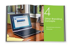
Other Branding Concepts Chapter – User Interface Design
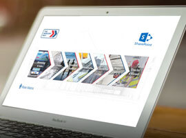
This visual guide will walk you through how to plan, design and create a brand with SharePoint 2013. Full-color pages offer an approachable way to learn how to launch a brand successfully with User Interface Design.
Order your copy today and save 40% off when you use promo code SPBRD at the check-out. (Offer only valid on print version and is valid until 31/12/13 on www.wiley.com.)
http://eu.wiley.com/WileyCDA/WileyTitle/productCd-1118495675.html
Link to free Link to free chapter http://media.wiley.com/product_data/excerpt/75/11184956/1118495675.pdf
Meet the Authors: Randy Drisgill, John Ross, Paul Stubbs
Q:
SharePoint 2013 Branding and User Interface Design is different from your previous SharePoint books? What is different and why?
A:
Some of the biggest changes in SharePoint 2013 were around the new design and branding features. Microsoft’s intent was to make it easier for traditional web designers to customize the SharePoint UI. If you look at other books on web design the books themselves are visually appealing. Our goal was to create the same quality of content that we did in the SharePoint 2010 book and add an extra element of design and style.
Q:
Will Randy’s Waffles still be open for business in this new book?
A:
Not only open for business but expanded from the mom and pop store to a global food brand. Besides being a fun way to profess our obsession with breakfast foods, Randy’s Waffles serves as a good example in the book for both a branded public facing site as well as showing off how branding would be different for a branded collaborative intranet site.
What are some new features for branding and user interface design within SharePoint 2013?
A:
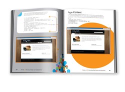
There’s been so many changes throughout the product. The user interface itself has been updated to be cleaner and more modern and it has been optimized to load faster. With the addition of Composed Looks and the Design Manager features in SharePoint 2013 there are more options for designers that aren’t used working directly with SharePoint branding concepts. We cover these features in depth as well as how you can create more advanced custom SharePoint 2013 branding using the traditional methods of working directly with master pages and page layouts. SharePoint 2013 is also more friendly to working with modern web design concepts than previous versions; our new book discusses how you can work with HTML5, CSS3, mobile devices and even responsive web design within SharePoint.
Q:
What do you hope readers will learn from reading SharePoint 2013 Branding and User Interface Design?
A:
SharePoint Branding can be tricky to even the best web designers. There’s some unique ways to create custom branding in SharePoint that’s different from any other platform. We think we have provided the most comprehensive collection of information and guidance on SharePoint 2013 branding that is available today as well as great examples (mostly about breakfast foods) to get you started!
Check out this blog by Randy Drisgill on the 5 New Features for Branding in SharePoint 2013.
Wrox – A Wiley Brand