It was my first PCF: the ColorfulOptionset 


 ; developed about two years ago and published on pcf.gallery: https://pcf.gallery/colorful-optionset/. This month we’ve got a very important and long awaited PCF feature: the Virtual Components. Of course I had to try it out, and the ColorfulOptionset seemed to be the best fit for this first try. And since I was at it, I’ve implemented a few more features I had in mind since a while. I plan to add even more features in the future: stay tuned.
Customizing
Customizing of colors
The base idea for this component is to allow the Choice components (OptionSet) to make a bigger impact by showing colors. The colors can be customized directly on the Options (unfortunately this is possible still only using the old “classic” customizing).
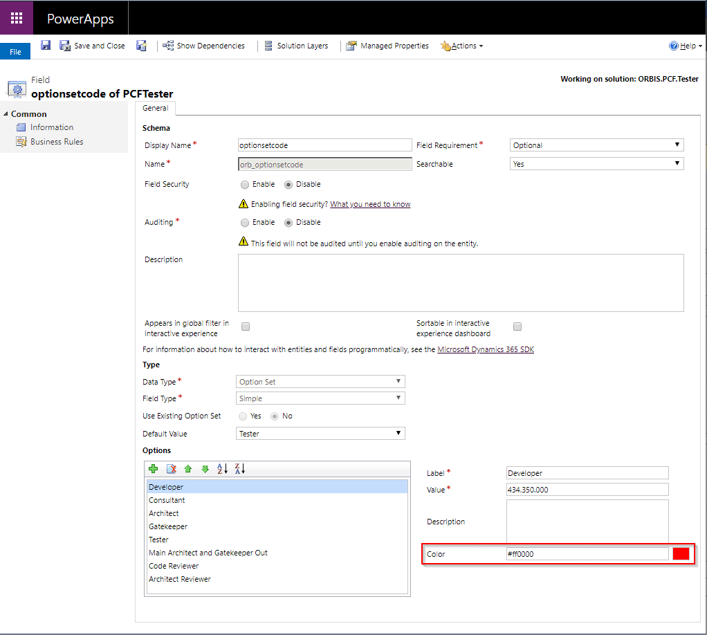
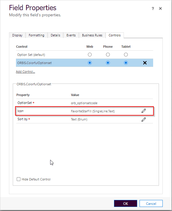
The rest is standard PCF customizing, by choosing the ORBIS.ColorfulOptionset component for your optionset control (I’ll get to the other parameters in a second)
Customizing the icons
The first version of the PCF could show only one type of icon. Mitch Milam called it “that thing with a dot” in his video “Join the Power Apps Component Framework (PCF) Revolution” (loved that). That’s because the icon I used was the FluentUI icon “CircleShapeSolid” .

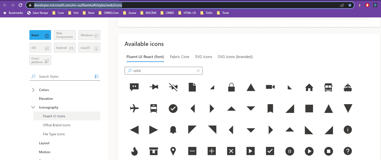
Starting with the new version (v1.1) you can choose an icon from the Fluent UI icons gallery. Just scroll down to “Available icons” and choose or search for the something that fits your column.
This icon can be used for the Icon-property (in the customizing image below, the icon was “FavoriteStarFill”
Extended customizing of icons and colors
Sometimes one icon is not enough, even if the colors are powerful. Sometimes it’s even more impactful if the component is showing different icons for different options. For that case, you can pass a JSON string as the “Icon” property. Let’s see some examples.
Like/Dislike
Let’s see something with “like/dislike/warning”:

The customizing would look something like this:
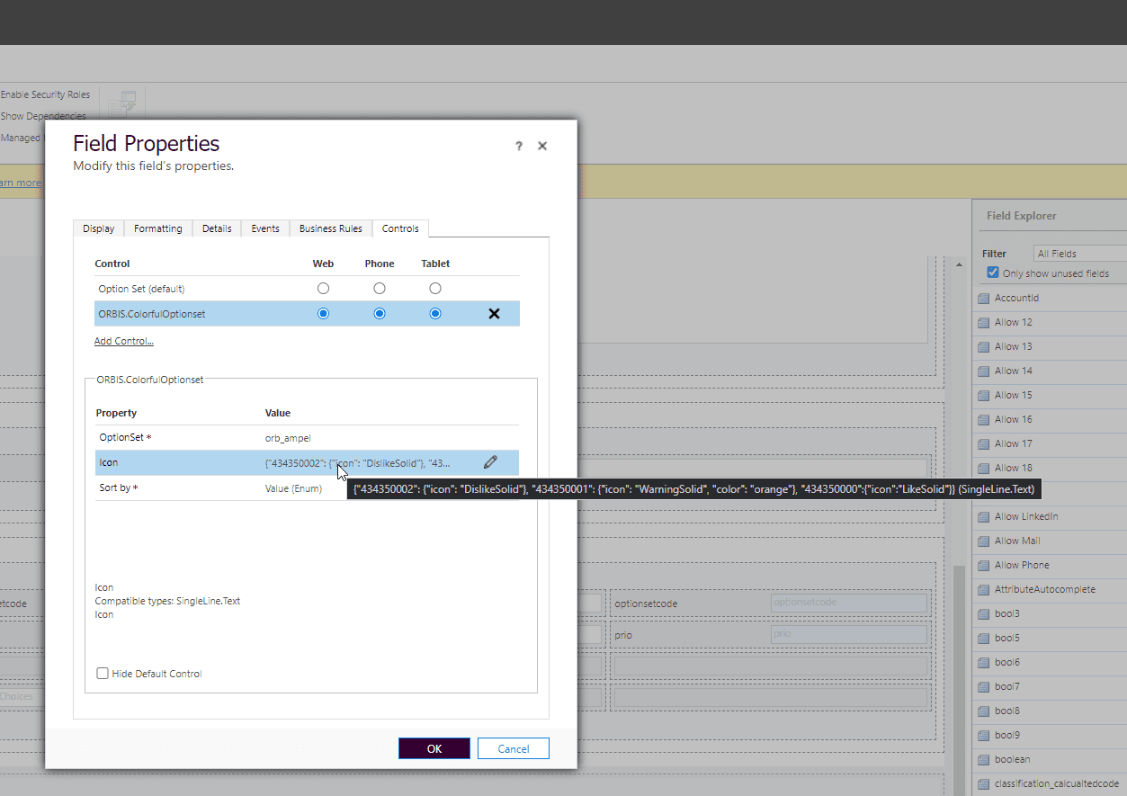
Let’s format the setting
{
"434350000": {"icon":"LikeSolid"},
"434350002": {"icon": "DislikeSolid"},
"434350001": {"icon": "WarningSolid", "color": "orange"},
}
So it’s a JSON object, where for each option we define the icon and/or the color.
For the options where the icon is not defined, the fallback will be the “CircleShapeSolid“.
The color doesn’t have to be specified. That’s only for the cases where the color from the customizing needs to be overridden. The color can be defined using the color name (like “red” or the hex code. (like #ff0000)
You can pass “both icon and color”, “only icon”, “only the color” or none.
Don’t forget to remove the formatting before you paste it in the “Icon” property.
Happy/Sad
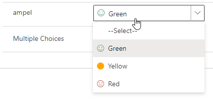
{
"434350002": {"icon": "Sad", "color": "#ff0000"},
"434350001": {                "color": "orange"},
"434350000":{"icon":"Emoji2"}
}
The icon for the second option is missing, so the “dot” is shown.
In this case I’ve set also the color to red, by using the “#ff0000”.
Sorting the options
Another feature introduced with the new version (1.1) is allowing to sort the options at runtime. Usually you define the options in customizing, and define also the order they should be shown. That it’s still the default for ColorfulOptionset.
But sometimes you would like to show the options in the alphabetical order. That’s not possible to do using only the customizing, because the users have different languages and the sorting will differ in each language.
That’s why I’ve introduced the 3rd property for the PCF: the SortBy property.
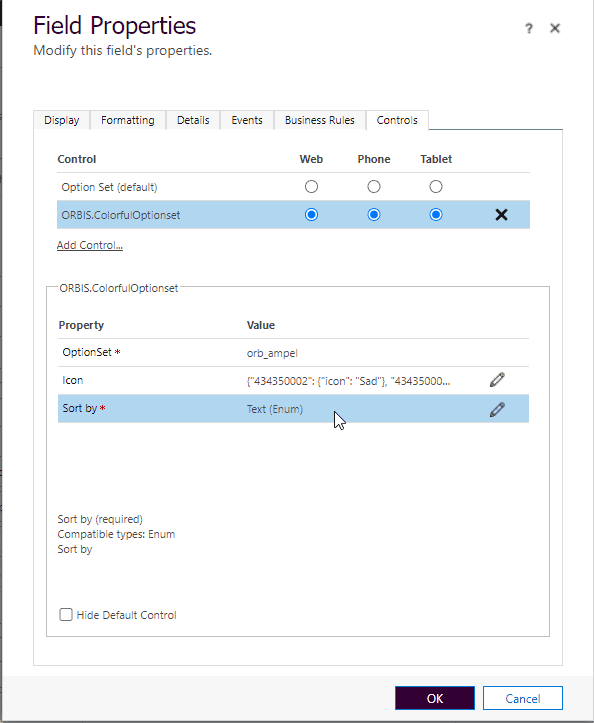
There are two options: Value and Text.
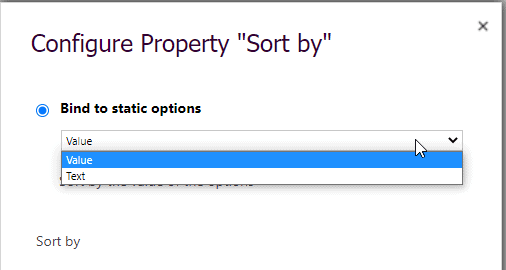
The default will be “Value” (the order defined by the customizing). The “Text” option will sort based on option-text in the user language.

Using the component
Virtual Component – much smaller and faster
One of the best improvements is using the new Virtual Components possibilities. When the component is virtual, it uses the platform own Virtual DOM, and the doesn’t have to bring it’s own React and FluentUI libraries.
We can see the difference by comparing the solution size: 5,85 KB, compared with the old 314KB. That’s a big difference.

But it’s getting even better, if we compare the bundle size:

Love it!
But the difference that really matter, is how fast the components are loaded now. I’ve recorded the behavior of the same form: the first part is with the standard component, the second one with virtual component version of the PCF. Remark the black box during the loading. Using the virtual component the controls are instant there, we practically have no loading time.
Isn’t it amazing? If feels like we’ve got un upgrade to 1st class.
The Virtual Component is a preview feature, and shouldn’t be used in production for now. If you would like to use the other improvements in production before the Virtual Controls reach General Availability, please let me know.
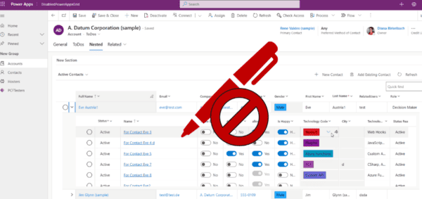
Using the ColorfulOptionse Virtual Component on Business Process Flows
Maybe you’ve seen the blog from Ben den Blanken about how to customize a PCFs on the BPF. The standard customizing doesn’t allow to add PCFs to BPF, but the runtime supports it. Thanks to Clément Olivier and Tanguy TOUZARD who offered us a great PlugIn for XrmToolBox , I could test the virtual version of the Colorful Optionset PCF also on the Business Process Flow. And it works like a charm.
I hope you enjoy the component.
For more great blogs click here.
About the Author:
Hi! My name is Diana Birkelbach and I’m a developer, working at ORBIS AG .
- Microsoft MVP
- Dianamics PCFLady
- Blogger (dianabirkelbach.wordpress.com)
- Power Platform Community Super User (Appstronaut)
- Principal Developer at ORBIS AG
- Dynamics 365 and Power Platform, since the Microsoft CRM version 1.2
Reference:
Birkelbach, D. (2022). Colorful Optionset PCF – Virtual and Improved. Available at: https://dianabirkelbach.wordpress.com/2022/04/24/colorful-optionset-pcf-virtual-and-improved/ [Accessed: 16th June 2022].


