A question I’ve received a couple of times recently is how to override slicer selections in Power BI visuals. Or more specifically, if the user selects a specific item in a slicer (or filter), how can I show data for other items a visual that may be related by my selection.
An example of this is a report showing a date slicer, where a user can select a specific date, but we want to display data for a range of dates before the selected date. This challenge is not the same as using a measure showing a single value that represents a range of dates; rather, we want to show more rows than what gets selected in the slicer.
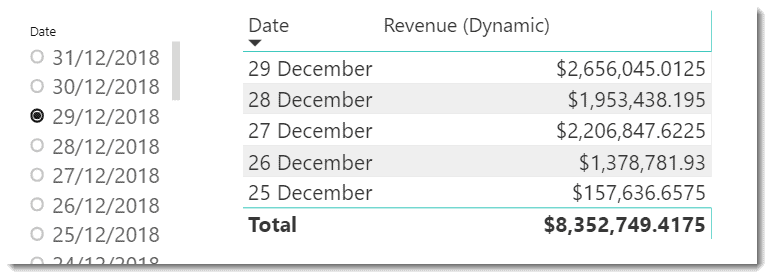
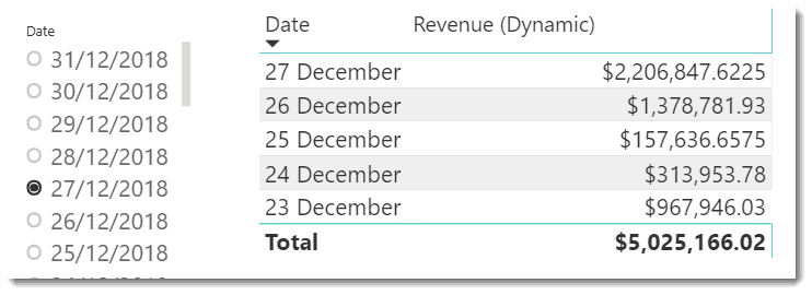
In the image above, the 29th of December is selected in the slicer, and the table visual is showing more than just data for this specific date. In this case, the [Revenue (Dynamic)] measure is hard-coded to show values for the five days preceding the selected date.
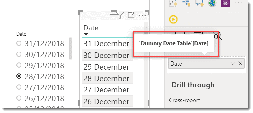
The update image shows the 27th December selected and the table show shows a set of dates related to the slicer selection.
How to solve
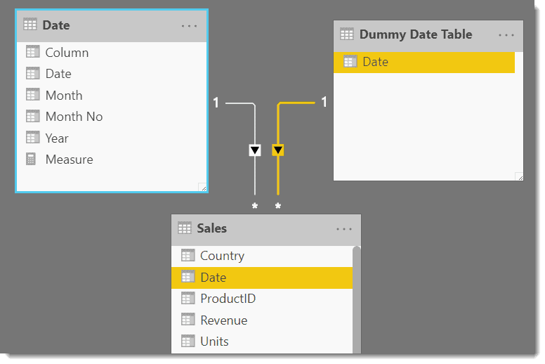
The trick to getting this working is to create a copy of the column used in the slicer in another table. Then, use the cloned column in both the axis of your visual AND in the DAX for your calculated column.
The first step is to clone the column from the slicer. In my case, I used the following DAX to create a single-column calculated table.
Dummy Date Table = ALL('Date'[Date])

I then create a relationship from the cloned table to the FACT table as follows.
Once this is in place, I can use the [Date] column from the ‘Dummy Date Table’ on the axis of my visual. Initially, this will produce a row for every value in the column regardless of what selections are set in the slicer.
The final part of the puzzle is to create a measure that checks the selected value from the slicer, and only returns a value for dates from the ‘Dummy Date Table’ that fall inside a prescribed range.
Revenue (Dynamic) =
VAR mySlicerDate = SELECTEDVALUE('Date'[Date])

RETURN
    CALCULATE(
        SUM('Sales'[Revenue]),
        ALL('Date'),
        FILTER(
            'Dummy Date Table',
            'Dummy Date Table'[Date] >  mySlicerDate - 5 &&
            'Dummy Date Table'[Date] <= mySlicerDate
            )
        )
Once a measure gets added to a visual, the default behaviour is the axis will only show a row when there is a non-blank value. The DAX code from this measure produces a blank value for every date outside the hard-coded five-day range. This default behaviour can get overridden, but we don’t want to do this in our case.
If more measures need to be added to the visual, the same DAX pattern should apply to each measure.

In my case, I also added a “What-If” parameter allowing the user to select a date range using a slider dynamically.
This technique can apply to scenarios other than dates. I used a date column here for this example, but by changing the DAX in the measure – you can use filters to find and show other rows of data that have a relationship to the value selected in the slicer.
The PBIX used in this example can be downloaded here.
As always, I’d love to hear from you if you find this technique useful and successfully apply it in your models.
About the Author:
I work on the Power BI customer advisory team (CAT) at Microsoft and spend my days tuning very large and complex Analysis Services data models. I learn plenty as I go, and primarily use this website to share what I can.
Reference:
Seamark, P. (2020). Overriding Slicers. Available at: https://dax.tips/2020/02/05/overriding-slicers/ [Accessed 6th Apirl November].
Find more great Power Platform content here.