Seems, Excel charts is an area that till now wasn’t considered in blogs as a target for Power Query application (Get & Transform in Excel 2016).
Nevertheless, PQ can replace some VBA solutions and make your workbooks macro-free.
In far 2015 my colleague Zoltán Kaszaki-Krsjak shared with me a very good example of how Power Query can help with generation of specific tables for specific charts, which are widely used in our organization.
Idea to write a blog post about this technique became dusty in me OneNote, and probably would wait more if only Jon Peltier hadn’t attracted my attention to this topic again by his recent post.
Sample workbook contains a solution for Bar-Mekko chart (or “variable width column chart”)
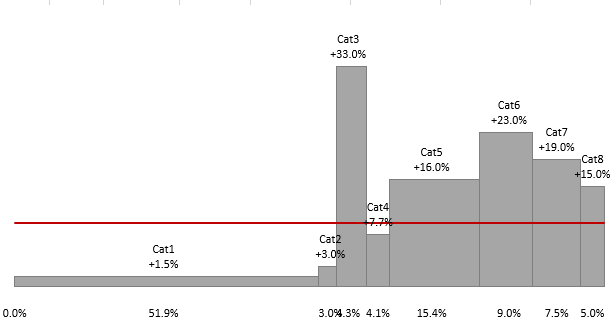
Power Query Variable width column chart
Such chart allows to easily see share of categories, growth or absolute value. Can be used to compare market segments or productivity of departments / subsidiaries. Red line in this case shows average growth – another small but important detail.
Interested how to build it?
Solution schema
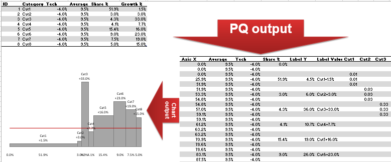
Solution schema
First of all, we need to prepare a basic table
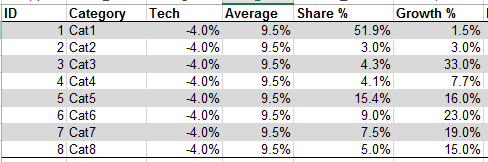
Prepare a basic table
“Average” contains same value as we need to draw a line.
“Tech” is a technical column, which is used for position of labels on X axis. It looks much better than standard Excel axis labels.
Share and Growth – corresponding Share and Growth for categories.
Using Power Query we will transform initial table to
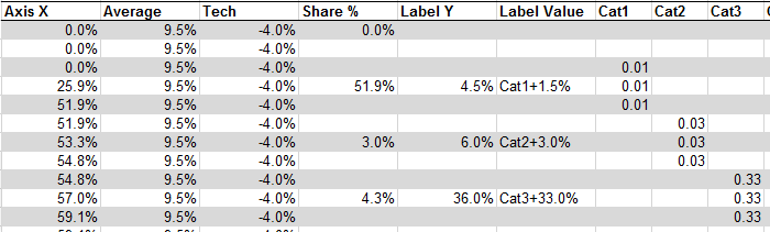
Using Power Query to transform initial table
Why and how to build a chart based on such table you may read in Jon Peltier’s post.
Here I will focus on Power Query part.
Zoltan’s version of transformation code is not very long, but contains interesting parts like
Running totals
Reference to previous row (with prevention of error)
Some parts of this M-agic code are really not obvious and do magic.
let

Source = Excel.CurrentWorkbook(){[Name="input_table"]}[Content],
add_empty_row = Table.Combine({Source, Table.FromRecords({[ID=0, #"Share %"=0] })}),
fill_constants = Table.FillDown(add_empty_row,{"Tech", "Average"}),
sort_id = Table.Sort(fill_constants,{{"IDder.Ascending}}),

add_running_sum = Table.AddColumn(sort_id, "X2", each
  List.Sum(List.Range( sort_id[#"Share %"], 0, [ID]+1)) * 100),

add_running_avg = Table.AddColumn(add_running_sum, "X1", each
  if [ID] = 0 then 0 else List.Average(List.Range( add_running_sum[X2], [ID]-1,2))),

duplicate_col = Table.DuplicateColumn(add_running_avg, "X2", "X3"),

#"unpivot_X1-X3" = Table.UnpivotOtherColumns(duplicate_col,
  Table.ColumnNames(Source), "Attribute", "Axis X"),

sort_rows = Table.Sort(#"unpivot_X1-X3",{{"IDing},
  {"Attribute", Order.Ascending}}),
add_index = Table.AddIndexColumn(sort_rows, "ID2", 1, 1),

#"Added New Label Y" = Table.AddColumn(add_index, "tmp", each
  if [Attribute] = "X1" then [Label Y] else null),
#"Removed Label Y" = Table.RemoveColumns(#"Added New Label Y",{"Label Y"}),
#"Renamed Label Y" = Table.RenameColumns(#"Removed Label Y",{{"tmp", "Label Y"}}),
#"Added New Label X" = Table.AddColumn(#"Renamed Label Y", "tmp",
  each if [Attribute] = "X1" then [Label Value] else null),
#"Removed Label X" = Table.RemoveColumns(#"Added New Label X",{"Label Value"}),
#"Renamed Label X" = Table.RenameColumns(#"Removed Label X",{{"tmp", "Label Value"}}),
#"Added New Share" = Table.AddColumn(#"Renamed Label X", "tmp", each
  if [Attribute] = "X1" then [#"Share %"] else null),
#"Removed Share" = Table.RemoveColumns(#"Added New Share",{"Share %"}),
#"Renamed Share" = Table.RenameColumns(#"Removed Share",{{"tmp", "Share %"}}),

Buffer = Table.Buffer( #"Renamed Share" ),

Categoty_tmp = Table.AddColumn(Buffer, "Category_tmp", each
  Buffer[Category]{[ID2]}? ),

Growth_tmp = Table.AddColumn(Categoty_tmp, "Growth_tmp", each
  Buffer[#"Growth %"]{[ID2]}?),

#"Replaced Value" = Table.ReplaceValue(Growth_tmp,null,"",
  Replacer.ReplaceValue,{"Category_tmp"}),
#"Pivoted Column" = Table.Pivot(#"Replacede", List.Distinct(
  #"Replaced Value"[Category_tmp]), "Category_tmp", "Growth_tmp", List.Sum),
#"Removed Columns" = Table.RemoveColumns(#"Pivoted Column",
  {"ID", "Category", "Growth %", "Attribute", "ID2", ""}),
#"Reordered Columns" = Table.ReorderColumns(#"Removed Columns",
  List.Combine({ {"Axis X", "Average", "Tech", "Share %", "Label Y",
  "Label Value"}, Source[Category] } ) )
in
  #"Reordered Columns"
Let’s start from this row
add_running_sum = Table.AddColumn(sort_id, "X2", each
  List.Sum( List.Range( sort_id[#"Share %"], 0, [ID]+1) ) * 100),
It calculates running total of specific column and converts percentage to number

Calculating running total
Next row calculates moving average (such approach deserves a separate post)
add_running_avg = Table.AddColumn(add_running_sum, "X1", each
if [ID] = 0 then 0 else
  List.Average(List.Range( add_running_sum[X2], [ID]-1,2))),
Using index column [ID] and function List.Range we can select necessary number of elements, then use any of List.* functions to calc desired.
In this particular case – List.Average.
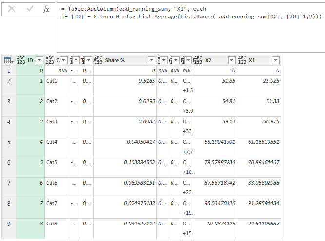
List.Average.
X1, X2, X3 – are future parts of Axis X.
We need these values to
- Draw an area charts – start and finish each chart at right place of Axis X
-
Place labels correctly – in the middle
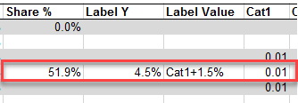
Labels & Values in Chart
Consider another interesting row
Categoty_tmp = Table.AddColumn(Buffer, "Category_tmp",
  each Buffer[Category]{[ID2]}? ),
It helps to shift values of column [Category] one row upwards.

“Why the heck he uses “?” in the end, and how part after “each” works?”.
Step-by-step
Separate expression on parts
Buffer [Category] { [ID2] } ?
Buffer – is a table
[Category] – is a column of this table
{ … } – is a reference to an item in this column
[ID2] – is a field, that is a result of step (add_index = Table.AddIndexColumn(sort_rows, “ID2”, 1, 1) – it contains number of each row. Small but important moment: this index starts from 1, when then first item of list and the first row of table have an ordinal index of zero.
Answer to “question mark problem”, we will find in a documentation to M language (can be found here)
We need part “Item Access”
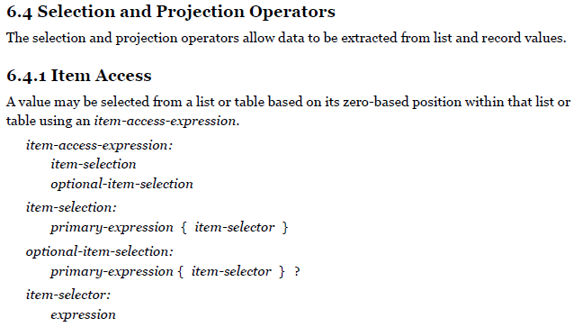
Item Access

Item Access Expression
And part about “?”
Item Access Expression
Looks like an idea for Gil Raviv’s pitfall-series.
Shortly, if you want to simply ignore error-causing references – use “?” to return null instead of error. Once again:
Categoty_tmp = Table.AddColumn(Buffer, "Category_tmp",
  each Buffer[Category]{[ID2]}? ),
Small challenge – make such shift of cells in a column without additional column.
And final part
Data labels for Axis X using additional Tech series can be updated using macro:
Sub update_tech_labels()

Dim r As Range
Dim s As Series
Dim i As Integer
Const series_name As String = "Tech"
Const offset_value As Integer = 1

For Each s In ActiveChart.SeriesCollection
  If s.Name = series_name Then
    Set r = Range(Split(Replace(s.Formula, "=SERIES(", ""), ",")(0))
    For i = 1 To s.Points.Count
     With s.Points(i).DataLabel
      .Formula = "=" & r.Offset(i, offset_value).Address(External:=True)
      .Font.Size = 9
     End With
    Next i
   Exit For
  End If
Next s

End Sub
I do not include it into sample-xlsx file to leave it macro-free.
Once you built your solution for Mekko, with your list of categories, you can apply this macro, then delete it. Data label references remain after data refresh.
In conclusion
Having such solution is a great help, it saves a lot of time.
But this is a workaround, hack of Excel charting possibilities – you have to prepare crazy table, then build several series of area charts…
OK, this is a secret knowledge, part of the Force, that saves job for me and other analysts.
However, Excel team added new charts in Excel 2016, maybe at some day we will see default Mekko as well.
Despite, Mekko chart for Power BI is available, it is full-Mekko, I couldn’t make a Bar-Mekko from it.
Bar-Mekko from my point of view is more readable, and can be very informative.
This demo solution doesn’t contain smart-labelling for Excel chart, instead it shows simple approach (not perfect)
For label position we can make an offset
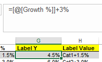
Label position offset
Can use CHAR(10) to add “new row” in label, “+” sign for positive, and custom number format using TEXT() function
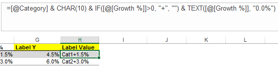
“new row” in label
As usually, you may find sample workbook here.
Reference:
Ivan Bond’s blog. (2017). Bar-Mekko chart in Excel with Power Query. [online] Available at: https://bondarenkoivan.wordpress.com/2017/02/13/bar-mekko-chart-in-excel-with-power-query/ [Accessed 14 Mar. 2017].