Introduction
In this article, we will learn how to extend your Viva Connections with our known SharePoint Framework (SPFx). We can extend our Viva Connections dashboard with out-of-the-box web parts, custom SPFx web parts, extensions, and now with Adaptive Card Extensions, etc.
What is Adaptive Card Extension?
Adaptive card Extensions are a new component type that can be created using SPFx. it can be also called ACEs for short form. ACEs use Microsoft Adaptive Card Framework to generate UI by declarative JSON schema. In simple words, you use JSON schema to specify what kind of controls/labels you wanted to show and then pass your dynamic data to render this Adaptive card to the user. One of the greater benefits of using an Adaptive card is that it takes care of rendering into multiple platforms automatically without us worrying about screen size and device etc. We can just focus on the actual component logic, the adaptive card framework will take care to fit the card into various platforms, screen sizes, and devices.
Let us start and create our first ACE component with SPFx
Step – Install latest SPFx Version
As of writing this article, the latest beta SPFx version is v1.14, use the below command to install the latest beta version, you can also install stable version SPFx 1.13.1
npm install @microsoft/generator-sharepoint@next --globalStep – Create a new SPFx solution
Go to the targeted path in your command prompt where you wanted to create a new SPFx solution, run the below command
yo @microsoft/sharepointNote – Latest version of SPFx needs at least 3.0.0 version of yeoman-environment, if you have lower than that, you can first install latest version(command below)
“This generator (@microsoft/sharepoint:app) requires yeoman-environment at least 3.0.0, current version is 2.10.3, try reinstalling latest version of ‘yo’ or use ‘–ignore-version-check’ option”
npm install --global yo
We will be asked a series of questions, you can choose/enter below for our sample
It will take a while to install all dependencies and then you should see below once it is completed
Step – Let us test Basic Card Template
Testing the ACE component would be similar to how we test our SPFx web part, we will have to run the gulp serve command then open workbench to add the component created on the Page.
Run below command
gulp serve -l --nobrowser
Open a SharePoint Workbench in the browser
https://yourtenant.sharepoint.com/sites/mysites1/_layouts/15/workbench.aspx
Click on Add icon, Click on the FirstBasicCard,
Once it is added, click on preview and you can see the below output.
ACEs are rendered as 1. Card view(above is card view) which renders on Dashboard or Page load.
We can also have 2. Quick View(below). Click on Quick view will open a popup to display the quick view of your component. this is also referred as ACE interaction. Please note that ACEs Interaction only works in Preview mode.
Let us now also see how we can configure ACE properties as we do with the SPFx web part. Click on the Edit web part icon in the edit mode of the page.
Close the Property window and click on the preview to see updated property values being displayed in ACE.
So that’s it, we have see how we can create a simple hello world ACEs component and test it in workbench, Next let us go to code and understand how the all of these is working together
Understanding the Code
Open the solution in your favorite code editor.
The Base Class
Open the file src\adaptiveCardExtensions\firstBasicCard\FirstBasicCardAdaptiveCardExtension.ts
export default class FirstBasicCardAdaptiveCardExtension extends BaseAdaptiveCardExtension<
  IFirstBasicCardAdaptiveCardExtensionProps,
  IFirstBasicCardAdaptiveCardExtensionState
{
//....
}
This is the main base class that will extend BaseAdaptiveCardExtension, it can also have two generics implemented one for persisted properties to pass parameters to this class and one for maintaining the state of these ACEs. If you are familiar with the SPFx web part this is very much similar to how to use property bags and state for your component.
renderCard Method
Overriding renderCard method to display our custom Card View. The below method is virtual overridden that returns a unique string identifier to our custom Card View
protected renderCard(): string | undefined {
  return CARD_VIEW_REGISTRY_ID;
}
If you would have noticed, the identifiers is declared at below 2 lines
const CARD_VIEW_REGISTRY_ID: string = 'FirstBasicCard_CARD_VIEW';
export const QUICK_VIEW_REGISTRY_ID: string = 'FirstBasicCard_QUICK_VIEW';
Note – Card view has default implementation but Quick View does not have a default implementation.
The default Card view will render using the following properties from the manifest:
- Icon:
iconProperty - Title:
title - Card text:
description
onInit Method
public onInit(): Promise<void> {
   this.state = {
     description: this.properties.description
   };
   this.cardNavigator.register(CARD_VIEW_REGISTRY_ID, () => new CardView());
   this.quickViewNavigator.register(QUICK_VIEW_REGISTRY_ID, () => new QuickView());
   return Promise.resolve();
 }
This would be initiation which will be called once. here you will see it is initiating state variable and registering the views using respective ViewNavigators. For quick view and Card view, there are different ViewNavigator classes.
Now let us explore the Card and Quick View created as part of solution
CardView Class
Go to “src\adaptiveCardExtensions\firstBasicCard\cardView\CardView.ts”

You will see here 3 methods
- data()
public get data(): IBasicCardParameters {
    return {
      primaryText: strings.PrimaryText,

    };
  }
This method is the main method that will populate the Card based on template type, as in this case, we can only have to only set primaryText which will be displayed as in the below place.
The current sample is getting this primary text value from the localization en-us.js file. You can extend this to get from anywhere else based on your logic.
Before moving to the next section let us understand 3 types of templates
- BaseBasicCardView
- This will allow us to set Title, PrimaryText, and Buttons.
- BaseImageCardView
- This will allow us to set image, Title, PrimaryText, and Buttons
- BasePrimaryTextCardView
- This will allow us to set Title, PrimaryText, description, and buttons
Each of these Views will render differently and have different constraints on what data can be provided to the template.
Let us try this by modifying our CardView.ts to change to use PrimaryTextCardView
In CardView.ts
Change the import to add “BasePrimaryTextCardView” and “IPrimaryTextCardParameters”
import {
  BaseBasicCardView,
  IBasicCardParameters,
  BasePrimaryTextCardView,
  IPrimaryTextCardParameters,
  IExternalLinkCardAction,
  IQuickViewCardAction,
  ICardButton
} from '@microsoft/sp-adaptive-card-extension-base';
Now modify the below line to change extends from “BaseBasicCardView” to “BasePrimaryTextCardView”

As soon as you do this, you will get the below error in data() method,

This is because PrimaryTextCardParameters will also require us to send description property which will be rendered below the primary text.
Change the data method to below
public get data(): IPrimaryTextCardParameters {
  return {
    primaryText: "My Primary Text",
     description: "This is my description"
  };
}
Save the file and go and run gulp serve again to see the changes in the workbench, you should see below output

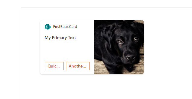
Same way if you extend the view from BaseImageCardView. we will have to set imageUrl and primaryText in data method(sample below)
public get data(): IImageCardParameters {
  return {
    imageUrl: "https://picsum.photos/id/237/200/300",
    primaryText: "My Primary Text"

  };
}
Below is how it will be displayed 🙂

cardButtons
This is an optional method but would be used when displaying buttons on the card and what actions to be taken when the button is clicked, if we modify your method to below it will add 2 buttons
      {
        title: strings.QuickViewButton,
        action: {
          type: 'QuickView',
          parameters: {
            view: QUICK_VIEW_REGISTRY_ID
          }
        }
      },
      {
        title: "Another button",
        action: {
          type: 'ExternalLink',
          parameters: {
            target: "https://www.siddharthvaghasia.com"
          }
        }
      }
    ];
  }
Below is how it will be displayed(if you have BaseImageCardView as extended class)
onCardSelection() method
public get onCardSelection(): IQuickViewCardAction | IExternalLinkCardAction | undefined {
   return {
     type: 'ExternalLink',
     parameters: {
       target: 'https://www.bing.com'
     }
   };
 }
The onCardSelection() is also an optional method that determines what will happen when the card is clicked. You can also open Quick view when it is clicked or it can be redirected to an external link. If you want to open quick view you have to pass QUICK_VIEW_REGISTRY_ID as parameters to specify which Quick View it should open.
QuickView.ts
Until now we have seen, Quick view being used in Card View, Let us go in detail about how QuickView looks like and how it is rendering and from where.
Go to src\adaptiveCardExtensions\firstBasicCard\quickView\QuickView.ts
The first thing we will notice here is there is an interface that will hold data for our Quick View.
import { ISPFxAdaptiveCard, BaseAdaptiveCardView } from '@microsoft/sp-adaptive-card-extension-base';
import * as strings from 'FirstBasicCardAdaptiveCardExtensionStrings';
import { IFirstBasicCardAdaptiveCardExtensionProps, IFirstBasicCardAdaptiveCardExtensionState } from '../FirstBasicCardAdaptiveCardExtension';
export interface IQuickViewData {
  subTitle: string;
  title: string;
  description: string;
}
export class QuickView extends BaseAdaptiveCardView<
  IFirstBasicCardAdaptiveCardExtensionProps,
  IFirstBasicCardAdaptiveCardExtensionState,
  IQuickViewData
> {
  public get data(): IQuickViewData {
    return {
      subTitle: "This is my subtitle, which is static",
      title: "My QuickView Title",
      description: this.properties.description
    };
  }
  public get template(): ISPFxAdaptiveCard {
    return require('./template/QuickViewTemplate.json');
  }
}
We would see below the output.

If you see the class should have below 3 generics implemented.
- TData: The type we wanted to return from the
data()getter method. - TProperties: Set of properties that we want to send to ACE (property bag).
- TState State object which will control the view that needs to be rendered
{S
  "schema": "http://adaptivecards.io/schemas/adaptive-card.json",
  "type": "AdaptiveCard",
  "version": "1.2",
  "body": [
    {
      "type": "TextBlock",
      "weight": "Bolder",
      "text": "${title}"
    },
    {
      "type": "ColumnSet",
      "columns": [
        {
          "type": "Column",
          "items": [
            {
              "type": "TextBlock",
              "weight": "Bolder",
              "text": "${subTitle}",
              "wrap": true
            }
          ]
        }
      ]
    },
    {
      "type": "TextBlock",
      "text": "${description}",
      "wrap": true
    }
  ]
}
Quick view provides us more control over the display as we can build any kind of Adaptive card possible using Adaptive card designers from here
Conclusion
In this article, we have learned how to create your first SPFx ACE and also understood the code structure and importance of files which will help us extend this Hello World ACEs component to your required business needs. More or less, if you are familiar with SPFx development and React, it would be easy to understand the concept and use state management to make this component dynamic in nature. We can get data from Graph API calls or any external API to display data in card view or quick view to pass it as parameters in the data method. ACE can also post data to any API using action type as Action.Submit on button click etc.
Hope this helps to understand the SPFx Adaptive Card Extension concept, Happy coding..!!!
Reference links
https://nanddeepnachanblogs.com/posts/2021-09-21-build-ace-spfx/
Available at: https://siddharthvaghasia.com/2021/12/29/create-your-first-adaptive-card-extension-with-spfx/ [Accessed: 29 April 2022].


