
In one of the projects, I was working on, I received feedback saying it is hard to understand how many items they have selected in a slicer, and it is not the first time I came across this. It is a valid point, especially when you have quite a few items in a slicer, you use a search bar to look for items, you select a couple, but you were not sure how many were selected.

https://cdn.dribbble.com/users/124059/screenshots/3995796/shot.gif
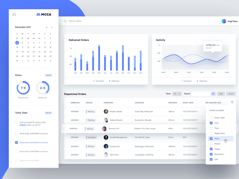
Obviously, there are many solutions to one problem. I have seen many reports displaying custom labels to handle this situation. Still, after some research for a better UX, I found this example on the dribble, which looked like an excellent design method.

Designing something like this in Power BI is easy!
The logic here, I will use a DAX measure to figure out how many items are selected and count those Items to display in an object.
I can display measure many ways, but I went for a Shape. Having shape allows me to use a shape type as a background; I can use a dynamic DAX expression to show the value. The only thing to note is, my DAX expression must be a string type. Hence, I created my measure like below.
Number of slected Artists Title =fixed(COUNTROWS(VALUES('Most streamed songs of all-time'[Artist])),0,1)
Next is the slicer visual. By default, I enabled the slicer header and used an empty character as text in the slicer header. If I keep the slicer header blank, whenever I hover over a slicer, it jumps down/up to make more options visible.

If I keep the slicer header not blank, that won’t be an issue. I like eraser but not the text on each slicer. It makes sense sometime but not all the time. In this case, I don’t want a slicer title.

The only way to have the slicer header with no title and no tooltip to display is by using Empty Character. So, I used an empty character as the slicer header. (Check my empty character blog to more about using empty characters in Power BI)

Then I went to change the title to DAX measure, grouped slicer and the shape. Now when I select multiple items, it nicely shows how many items were selected. When none is selected, it shows all the items available in the slicer.

In this example, I don’t have many values, so a nice round shape works but based on several results, I may go for different Shape types or location.
To make it work perfectly, I mean to make this shape to show the right number irrespective of other visuals cross-filtering can be a tiring job.


The other way to handle this is by creating a new table and creating a relationship. So, in this example, I have Artists and their Total streams. I am using Artist in my slicer from Most Streamed songs table. When I select an Artist in another visual, by default, my measure also gets filters.

If I create another table with a distinct Artist, use that in my slicer, also use the same column to count, and in all other visuals, I use the Artist from the Most Streamed songs table; then I get the result I want.
Steps:
- Created an Artist table
- Create a relationship between my streams table and Artist table
- Update my slicer to get Artist names from Artist table
- Update measure to get Artist name from Artist table now.
- Rest of the visulas gets Artist from Most Streamed songs table

Cross-filtering doesn’t impact the value I’m showing. I hope this inspires someone out there. Let me know what you think?
Until next time,
Prathy
Find more great blogs here.
About the Author:
Hi! I’m Prathy Kamasani, born in India and living in London. Currently, working as an independent contractor. I love smiles, technology and art. Technology excites me that eventually brought me into the data world. Hence, this blog is all about my journey with data.
Reference:
Kamasani, P. (2022). SHOWING THE NUMBER OF SELECTED ITEMS IN A #POWERBI SLICER. Available at: https://prathy.com/2021/10/showing-the-number-of-selected-items-in-a-powerbi-slicer/ [Accessed: 8th August 2022].


