This blogpost is the beginning of a series about combining Custom Pages and Custom APIs, but also using the Creator Kit and a bit of TypeScript in the process.
I’ll show you how to start and how to build the UI and the custom logic, and finally I will show you how combine them by telling you my business scenario.
This first blogpost is about the UI, I mean how to create a Custom Page using the Creator kit and the next one will be about how to delegate all the heavy work to a custom API. So let’s start.
A couple of months ago I was working on a Dynamics 365 Sales project, now we know that the normal sales process goes from Lead, opportunity, then we have to create an offer, and when the customer approves it, that offer becomes an order and later becomes an invoice.
Well, in my case I have a specific requirement which is to allow the user to split the payment of the quote, like 50% by card and 50% in cash. But this splitting process must be based on the products in the quote. That is, the user can split the cost of a quote product into multiple payments.
In short, I have to provide an interface for the user to choose one or more quote products and allow them to create one or more payments.
Crazy, right? Because what I did know up to that point is about requirements to split the total cost of a quote or invoice into multiple payments, for example sometimes we want to pay 50% cash and 50% by card. Well, now with this requirement this logic should be applied let’s say at line level instead of header level.
This kind of features do not come by default inside Dynamics 365 Sales, so I was thinking well how can I achieve this requirement?
To start with, I would like to recommend you to write a small paragraph about the requirement, as the general idea of what the user wants.
So, I wrote this, “The user should be able to enter the desired Quote, from there they should be able to click a button on the Quote ribbon and it will open the Custom Page as a modal, then they can select one or more products from the quote, and they also has to specify some data to the selected records and then the payment records should be created automatically”.
After all I’ve said, you now have a general picture about what the user wants, and I bet you’re also thinking about the ribbon button on the quote form and the logic to create all the payment records automatically.
Well don’t worry let’s focus first on the UI by creating the Custom page in this blogpost and in the next one I will show you how to create the other technical components to meet this requirement.
So let’s start.
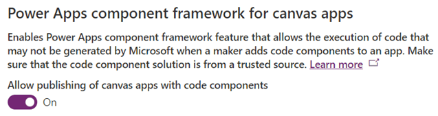
Enable Power Apps component framework for canvas apps
First thing first, we will be using components from the Creator Kit solution, so we need to enable this feature in order to be able to add the required components in the Custom page.
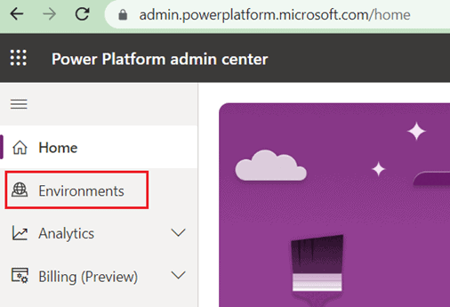
You have to go to the URL: https://admin.powerplatform.microsoft.com/
From there you have to select Environments:
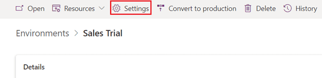
Select your desired environment, then go to Settings:
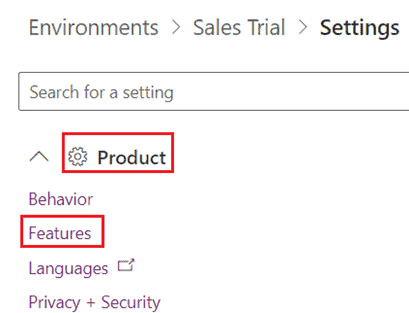
Under Product, select Features:
Then enable the PowerApps component framework for canvas apps:
Download both Power Platform creator Kit solutions
The next step is to go to this URL: https://learn.microsoft.com/en-us/power-platform/guidance/creator-kit/setup, download the core solution and the CreatorKitReference(MDA) solution.
Finally install first the core solution and then the MDA solution. Now let me explain to you what these solutions are for, the core solution contains ready to use components like DetailsList, CommandBar, SearchBox, ProgressIndicator, etc. And of course we’ll be using the DetailsList component our Custom Page.
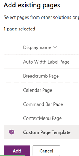
The CreatorKitReference(MDA) solution contains Model Driven Apps and Custom Pages templates to create them in a few clicks, and guess what we will create a Custom Page using a template.
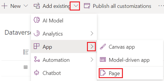
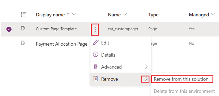
This is going to help us to save a lot of time creating it from scratch. So first go to your solution and from there click in “Add an existing Page”:
Then Select Custom Page Template and add it:
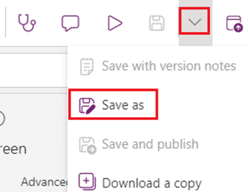
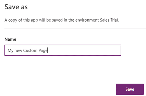
Next is to open that Custom Page and save it as, and put it a new name:
Finally you have to remove the Custom Page Template:
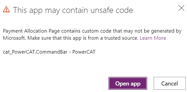
Now open your Custom Page, you will get a message saying that your page contains unsafe code, but don’t worry because you are using a solution supported by Microsoft, so just click in Open app:
There you go, a Custom Page with a command bar, a search box components ready to use and containers to make it responsive in just a few clicks, impressive right? This will save you a lot of time.
Modifying OnStart property
Now first thing first, specify the corresponding variables and collections in the OnStart property:
Set(var_recordId,Substitute(Substitute(Param(“recordId”), “{“, “”), “}”,””));
Set(var_quoteRecord,LookUp(Quotes,Quote = GUID(var_recordId)));
ClearCollect(coll_quoteProducts,Blank());
ClearCollect(coll_PaymentAllocations,Blank());
Set(var_NewRecord,Defaults(AddColumns(DropColumns(‘Payment Allocations’,”_cre19_customer_value”,”_ownerid_value”),”PaymentMethodid”,””,”RecordProductId”,”InternalId”,”ContactId”,””,”AccountId”,””)));
Set(var_varNumber,0);
Set(var_totalAmount,0);
In my case I have added a table called Payment Allocations, and underneath that table there are a few fields that help to specify the payment information, like:
- Funding type (Account or contact)
- Payment Method (Card, Invoice, Cash)
- Customer which will actually make the payment
- Start Date and End Date to specify the range of time that the payment can be made
- The percentage of the payment and the amount of the payment
Now, let me explain to you why I’m using these variables and collections.
Var_recordId: It is to store the GUID of the record from the Model Driven app on which the user is clicking the button. In this case it will be the GUID of the appointment.
var_quoteRecord: It is to store all the Quote columns, retrieving them by using the previous variable.
coll_quoteProducts: This collection will help us to store all the Quote products that has been selected by the user.
coll_PaymentAllocations: This collection will help us to store all the Payment Allocation records the user creates every time they click on +Add button.
var_NewRecord: It is to add a new record in the previous collection. This variable is a copy of a Payment Allocation record, but with the difference that all fields are empty.
var_varNumber: Is to give a unique ID to each record on the coll_PaymentAllocations collection.
var_totalAmount: It is to add up the cost of all selected Quote products, this will help to calculate the percentage and amount of the Payment Allocations on the selected records.
Now remember we are trying to create a Custom Page to allow the user to select one or more Quote Products in order to split them into one or more payments. Having said that let’s add two other main items, the DetailsList component on the left and a vertical Gallery on the right.
Adding some containers
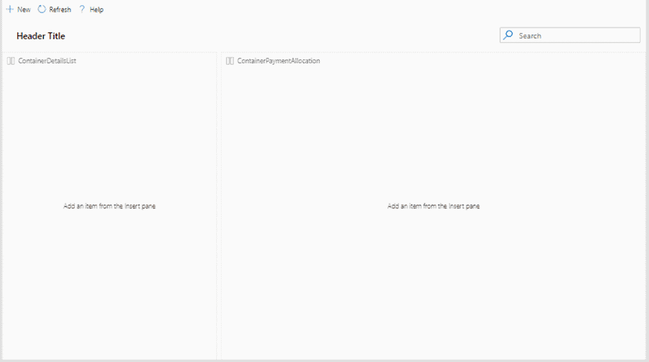
So let’s add two horizontal container under ContentContainer_HS:
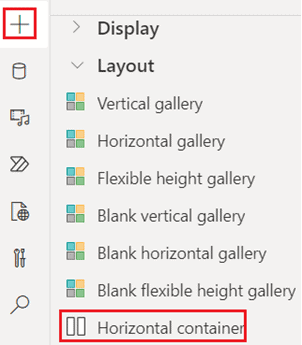
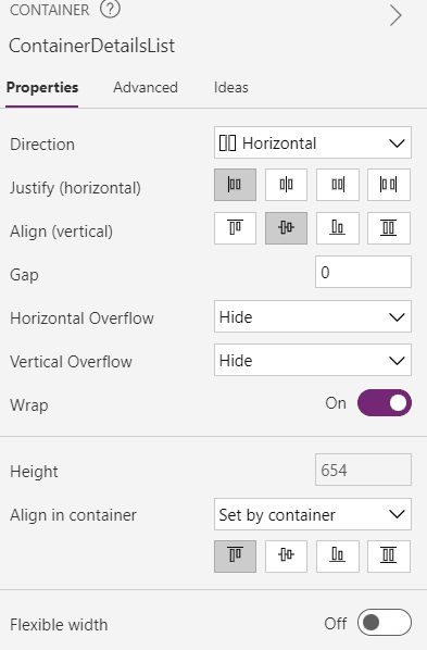
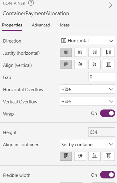
Let’s call ContainerDetailsList to the first container and ContainerPaymentAllocation to the second container
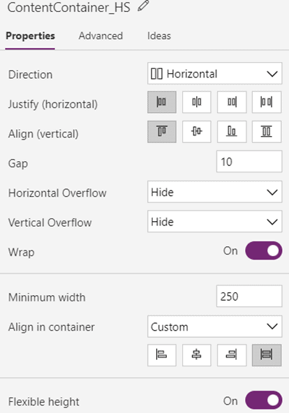
Now we have to change the ContentContainer_HS container a little bit, make sure it’s a Horizontal container and all the following properties:
Now it’s the turn for ContainerDetailsList container, make sure Width property is Parent.Width/3 and Height property is Parent.Height:
Finally is the turn for ContainerPaymentAllocation container, make sure Width property is Parent.Width and Height property is Parent.Height:
With those updates to the containers now the Custom Page should looks like:
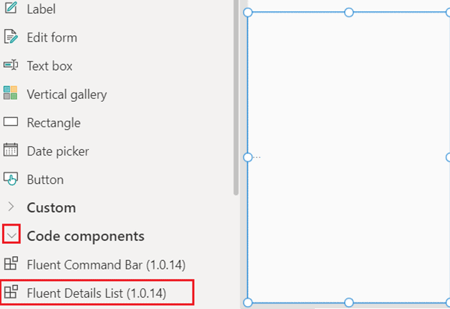
Adding DetailsList component
Next step is to import the DetailsList component:
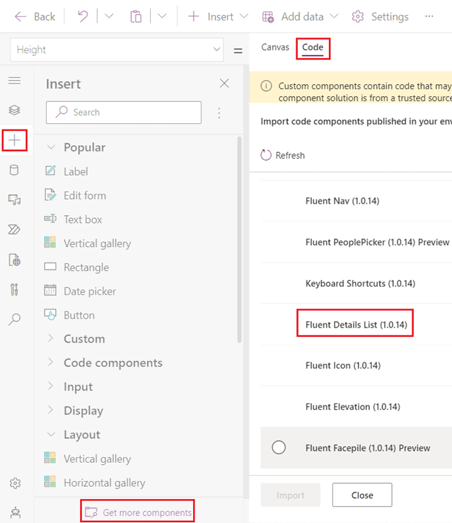
After import it, the component is available to be added to the Page, so go to Code components and add it inside ContainerDetailsList container:
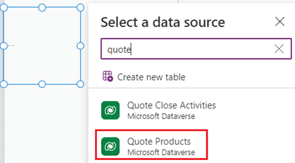
Now we have to set a data source to the DetailsList component, the table for this is Quote Products:
Now we have to specify which fields are available for this component, so we need to go to Fields property:
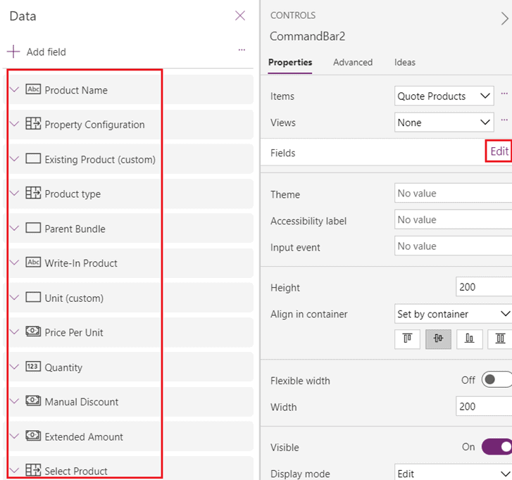
If you want to add a field just click in Add field and that’s it.
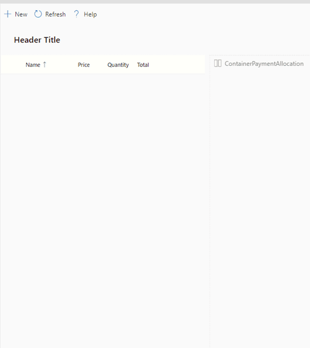
Now we have to specify which fields will be displayed out of all the fields that are available, to do that we have to go to columns_items property and depending on what fields you want to make visible, you can copy and paste this formula or you can update it a little bit to fit your requirement:
Table(
{
ColName: “productname”,
ColDisplayName: “Name”,
ColWidth: 100,
ColSortable: true,
ColIsBold: true,
ColResizable: true
},
{
ColName: “priceperunit”,
ColDisplayName: “Price”,
ColWidth: 50,
ColSortable:false,
ColIsBold:true,
ColResizable: true
},
{
ColName: “quantity”,
ColDisplayName: “Quantity”,
ColWidth: 50,
ColSortable: true,
ColIsBold: true,
ColResizable: true
},
{
ColName: “extendedamount”,
ColDisplayName: “Total”,
ColWidth: 50,
ColSortable: true,
ColIsBold: true,
ColResizable: true
},
{
ColName: “cre19_allocationpercentage”,
ColDisplayName: “Allocation %”,
ColWidth: 90,
ColSortable: true,
ColIsBold: true,
ColResizable: true
}
)
In my case I’ve added a custom column (cre19_allocationpercentage) in Quote Products table, to show the user the percentage into which each product cost has been divided.
Now let me explain these properties that we can see on each column:
- ColDisplayName: (Required) – Provides the name of the column to show in the header.
- ColName: (Required) – Provides the actual field name of the column in the Items collection.
- ColWidth: (Required) – Provides the absolute fixed width of the column in pixels.
- ColSortable: True when the column should show be sortable. If the dataset supports automatic sorting via a direct Dataverse connection, the data will automatically be sorted.
- ColIsBold: True when the data cell data should be bold
- ColResizable: True when the column header width should be resizable.
- If you want to know more about the rest of properties and DetailsList component, please go to Microsoft Documentation.
Next you have to specify the following properties:

SelectionType: Multiple
- RaiseOnRowSelectionChangeEvent: true
- Height: Parent.Height
- Width: Parent.Width
- OnChange:
If(
Self.EventName = “OnRowSelectionChange”,
ClearCollect(
coll_quoteProducts,
AddColumns(
Self.SelectedItems,
“AllowAddRecord”,
true
)
);
Set(
var_totalAmount,
Sum(
Self.SelectedItems,
‘Extended Amount’
)
)
);
ForAll(
Self.SelectedItems,
If(
‘Allocation percentage’ >= 100,
Patch(
coll_quoteProducts,
Last(coll_quoteProducts),
{AllowAddRecord: false}
)
)
)
Again let me explain to you these properties.
Items: Here we have to specify the data source of the component, and we are also using the searchbox component to filter the list every time the user types something in the searchBox component.
SelectionType: It is to allow the user to select more than one record from the list.
RaiseOnRowSelectionChangeEvent: It is to trigger some custom logic when the user selects a record from the list.
OnChange: This property is to execute some custom logic each time the user selects one or more records from the list. This logic adds the selected records to coll_quoteProducts with a new column called AllowAddRecord (true).
Next, the cost of all selected quote products is summed. Finally, it validates if the selected products have already been split, if so, the value of AllowAddRecord is false.
After specifying all these properties, the component should look like this:
Modifying the Command Bar component
The next step is to update the command bar component, and you should start by updating the items property.
By default you will see that there are already some buttons visible in the component, but in this business scenario we only need two buttons. One to add a new Payment Allocation record in the corresponding collection and the other button to call a cloud flow and send all the payment allocations.
Items: Table(
{
ItemKey: “New”,
ItemIconName: “Add”,
ItemDisplayName: “New”
},
{
ItemKey: “upload”,
ItemIconName: “Upload”,
ItemDisplayName: “Confirm”
}
)
Be aware of the ItemKey property in this formula, because that will be validate on the OnSelect property which is the next property to update.
OnSelect: Switch( Self.Selected.ItemKey,
“New”, Select(btn_add),
“upload”, Select(btn_confirm)
)
Here is a tip, when you have sort of big Power Fx formula, and you want to keep clean other components from it, then I’d recommend to you to put those big formulas in hidden buttons.
So here we have two hidden buttons, btn_add and btn_confirm.
OnSelect (btn_add):
If(
Last(coll_quoteProducts).AllowAddRecord = true,
Set(
var_varNumber,
var_varNumber + 1
);
Collect(
coll_PaymentAllocations,
Patch(
var_NewRecord,
{InternalId: Text(var_varNumber)}
)
),
Notify(“Some of the selected quote Products have already been split 100%.”)
)
So this logic is executed every time the user clicks the +Add button. First it validates if the last record added in the coll_quoteProducts collection has true in the AllowAddRecord column, if so, it increments the var_varNumber variable by 1.
And also adds a new PaymentAllocation record to the coll_PaymentAllocations collection but specifying the InternalId column with the new value of var_varNumber.
This ensures that each new record in the coll_PaymentAllocations collection has a unique InternalId.
If the last record added in the coll_quoteProducts collection has false in the AllowAddRecord column, then shows a message to the user and nothing is added to the coll_PaymentAllocations collection.
That’s enough for now in this component, let’s leave the confirmation button for the end.
Adding a vertical gallery
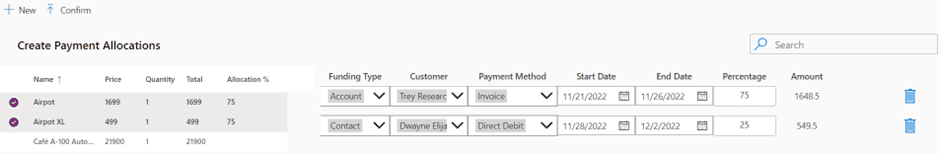
Now is the turn for the vertical gallery on the right side of the screen. This gallery will show the Payment Allocation records the user adds by clicking +Add button.
Before I described that I created a new table called Payment Allocations in order to store Payment Allocations records and underneath that table there are a few fields that help to specify the payment information, like:
- Funding type (Account or contact)
- Payment Method (Card, Invoice, Cash)
- Customer which will actually make the payment
- Start Date and End Date to specify the range of time that the payment can be made
So you have to add a vertical gallery and add these fields to it:

The icon on the right side is to delete the corresponding record from the collection.
Remove(coll_PaymentAllocations,ThisItem)
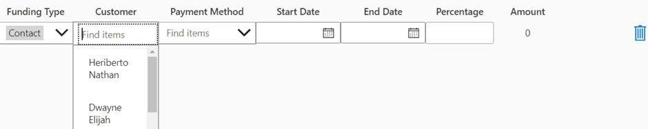
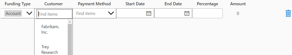
And you can also see that the customer field is hidden, but there are actually two fields, one for the account and one for the contact and both are placed in the same place.
If the user chooses Account in the funding type, the account field is shown and vice versa:
Be aware also that the amount field is a label because in my case was read only.
This amount lable should has on the Text property the following formula:
(var_totalAmount*dcv_percentage.Text)/100
dcv_percentage is the name of the Percentage field.
It is also worth to mention that each field on the gallery should have this on OnChange property: Select(Parent)
And The OnSelect property: false
The next step is to update the OnSelect property on the gallery:
RemoveIf(coll_PaymentAllocations, InternalId=Blank());
If(
Sum(
gal_payment_allocations.AllItems,
Value(dcv_percentage.Text)
) > 100,
Notify(“The total of the payment allocation percentages for a quote line must not exceed 100%.”),
Patch(
coll_PaymentAllocations,
ThisItem,
{
RecordProductId:”{“& Char(34)&”QuoteProductIds” &Char(34) &”:” & JSON(coll_quoteProducts.’Quote Product’) &”}”,
Name:”{“& Char(34)&”RecordProductNames”&Char(34) &”:” &JSON(coll_quoteProducts.Name) &”}”,
‘Funding Type’: dcv_fundingtype.Selected.Value,
Account: dcv_account.Selected,
Contact: dcv_contact.Selected,
AccountId:dcv_account.Selected.Account,
ContactId:dcv_contact.Selected.Contact,
‘Payment Method’:dcv_paymentmethod.Selected,
PaymentMethodid: dcv_paymentmethod.Selected.’Payment Method’,
‘Start Date’:dv_startdate.Value,
‘End Date’:dv_enddate.Value,
Percentage: Value(dcv_percentage.Text),
Amount: Value(lbl_amount.Text)
}
)
);
If(
Sum(
gal_payment_allocations.AllItems,
Value(dcv_percentage.Text)
) > 100, Reset(dcv_percentage))
First it validates if the InternalId is empty, if so that record is removed from the collection. Then it also validates if the sum of the percentage in all the records is greater than 100, if so a message is shown to the user and nothing happens.
Finally, if everything is OK, the collection is patched with all the information entered by the user in each field.
Finish the Custom Page with the confirm button
Finally we can go back to the confirm button.
In a nutshell this button is validating if every field is filled correctly on each record from the coll_PaymentAllocations collection.
If at least one of these fields is empty, then a message is shown to the user to letting them know that all the Payment Allocations fields should be filled.
If all fields are filled then this button calls a cloud flow sending the coll_PaymentAllocations collection in JSON format:
OnSelect: ClearCollect(
colCallFlow,
{Var: true}
);
ForAll(
coll_PaymentAllocations,
If(
CountRows(
Filter(
coll_PaymentAllocations,
IsBlank(‘Start Date’)
)
) > 0,
Patch(
colCallFlow,
First(colCallFlow.Var),
{Var: false}
);
Notify(“Start date field is empty in some payments”),
If(
CountRows(
Filter(
coll_PaymentAllocations,
IsBlank(‘End Date’)
)
) > 0,
Patch(
colCallFlow,
First(colCallFlow.Var),
{Var: false}
);
Notify(“End date field is empty in some payments”),
If(
CountRows(
Filter(
coll_PaymentAllocations,
IsBlank(Percentage)
)
) > 0,
Patch(
colCallFlow,
First(colCallFlow.Var),
{Var: false}
);
Notify(“Percentage field is empty in some payments”),
If(
CountRows(
Filter(
coll_PaymentAllocations,
IsBlank(PaymentMethodid)
)
) > 0,
Patch(
colCallFlow,
First(colCallFlow.Var),
{Var: false}
);
Notify(“Payment Method field is empty in some payments”),
If(
CountRows(
Filter(
coll_PaymentAllocations,
IsBlank(‘Funding Type’)
)
) > 0,
Patch(
colCallFlow,
First(colCallFlow.Var),
{Var: false}
);
Notify(“Funding Type field is empty in some payments”),
If(
ThisRecord.’Funding Type’ = ‘Funding Type (Payment Allocations)’.Account,
If(
IsBlank(ThisRecord.AccountId),
Patch(
colCallFlow,
First(colCallFlow.Var),
{Var: false}
);
Notify(“Account field is empty in some payments”)
),
If(
IsBlank(ThisRecord.ContactId),
Patch(
colCallFlow,
First(colCallFlow.Var),
{Var: false}
);
Notify(“Contact field is empty in some payments”)
)
)
)
)
)
)
)
);
If(
First(colCallFlow).Var,
Set(
ResponseFlow,
‘Flow-CallPaymentAllocationsCustomAPI’.Run(JSON(coll_PaymentAllocations))
);
Refresh(‘Quote Products’);
Notify(JSON(ResponseFlow));
ClearCollect(
coll_quoteProducts,
Blank()
);
ClearCollect(
coll_PaymentAllocations,
Blank()
)
)
Conclusion
After creating the customized page using the Power Platform Creator Kit, I have a few points I would like to highlight:
- Creating a custom page using a template from the Power Platform Creator Kit saves you a lot of time, you don’t have to worry about containers anymore, at least not from scratch.
- By default you get the Command bar and the Search box components so you don’t have to worry about that either. Although it is true that you have to configure the command bar buttons (Items and OnSelect properties)
- Using DetailsList component is the best option to simulate UI and functionality of a Model Driven App view. After you configure it you have features out of the box such as Sort by, Resize columns, multiple selection and drill down by doing double click.
- Before start creating your Custom Page, remember turn on “PowerApps component framework for canvas apps” feature on all your environments
- You can create the same user experience with an embedded canvas app, but remember that an embedded canvas app require to be shared with users and takes a few seconds to load.
Stay tuned for the second blogpost in this series.
This blog is part of Power Platform Week,
About the Author
My name is Wilmer Alcivar, originally from Ecuador, I started in the CRM world in 2012. I’m a big Juventus fan and like to spend time with my girlfriend, try all kinds of beers, play video games and try my best to keep up with new features of the Power Platform.
But let’s rewind the clock a bit. In my early days, I started out as a PHP developer. That’s why my CRM journey started with Sugar CRM, however, in 2013 I moved to the light side of the force with the Microsoft Dynamics CRM, or at least that’s what it was called at the time.
My first version was Dynamics CRM 2011 On-Premise, and boy it was a great version. I remember it with much appreciation because my first project was for a Peruvian Bank. This meant often traveling to clients’ offices – and yeah let me tell you I picked up quite a taste for Peruvian food.
At the time, I also had other projects in the 2013 version. It’s no secret that everyone disliked the 2013 version (including me). Things started to turn around again with the 2015 version. The same year I moved to Uruguay in order to improve my technical knowledge.
I enjoyed my time in Uruguay getting to know a new culture, they are passionate about football and I had the opportunity to learn a lot about Dynamics 365 at the same time. I carry Uruguay in my heart because it was there where I met my girlfriend Viviana.
After some time, we decided together to move again, this time to Spain looking for new challenges in our professional life. Read more.
Reference
Alcivar, W., Year Unknown, Build a Custom Page using Power Platform Creator Kit, Available at: Create a Custom Page using Power Platform Creator Kit (wilmeralcivar.com) [Accessed on 23 January 2023]