Disabling controls on a form is a top requirement for model-driven apps projects. Of course this logic needs to be enforced on grids too.
In case you are aware about “why we need this” and “what are the challenges”, and are looking for the solutions, you can jump directly to #Solutions. I’ve implemented 3 solutions, from simple to more complex (but with the better user experience).
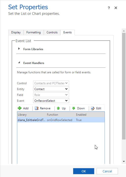
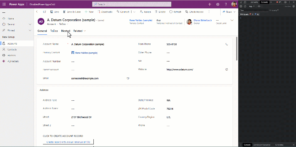
Right now on views we can use Editable Grid or the Power Apps Grid standard PCFs to edit the data, where we can set the if the grids are editable. At this point is all-or-nothing: set all columns on editable/or not. In order to disable specific columns, or to disable only some cells based on dynamic conditions (so possible based on other cells) we can use the JavaScript WebResources. To customize that, we can use the “Events” tab, select the event “OnRecordSelect” and register the function where we can use the GridCell sdk: setDisabled.
This works also for nested grids (below a code snippet from Benedikt Bergmann’s blog for disabling cells in a nested Grid inside Editable Grids):
functiononGridRowSelected(eventContext) { eventContext.getEventSource().attributes.forEach(function(attr) { attr.controls.forEach(function(myField) { myField.setDisabled(true); }); });} |
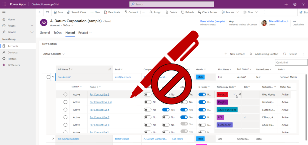
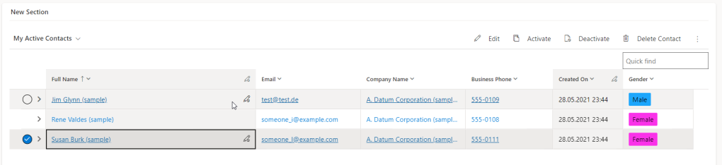
Disabling cells using JavaScript WebResource works for both Editable Grid and Power Apps Grid (but inside Power Apps Grid there are some edge cases where the user can still edit the cells, depending on how fast and where the user clicks):
The purpose of this blog
First of all, I would like to say that I would always use the (form) scripting to disable cells if possible. But there are a few cases where this doesn’t work. Some examples I came across (if you know more cases or solutions for my use-cases, please let me know, and I would gladly correct this):
1. Dashboards
Using Power Apps Grid inside Dashboards doesn’t allow to attach the grid events, so no way to use the scripting there.
2. Async events
When the condition to disable cells is based on columns that are not inside the view, we need to fetch the data first. In my tests it turned out we cannot use the OnRecordSelect event to fetch the missing data and disable the cells when the promise returns. This problem happened both for Editable Grid and Power Apps Grid. I’ve tried out something like this, but didn’t work:
//if the code to disable cell is executed async, it doesn't work.functiononGridRowSelected(eventContext) { const attributes = eventContext.getEventSource().attributes.get(); const myPromise = newPromise((resolve, reject) => { window.setTimeout(resolve,1000); }); myPromise.then(() => { attributes.forEach(function(attr) { attr.controls.forEach(function(myField) { myField.setDisabled(true); }); }); })} |
Of course a solution could be to add the missing columns to the view. But sometimes there are quite a few views to modify. And the user would end up with unneeded columns. Also, the user can use the “Edit columns” feature, and add columns to any view. Among them there could be columns which need to be disabled; the maker has no control over which columns were added. Thinking that way, this use-case could be pretty common.
I was thinking if it’s possible to load the missing columns when the grid loads the data, but unfortunately only the Read-Only subgrid has the OnLoad event; no help for editable grids.
3. Disabling the cells of the Power Apps Grid nested grids
In my tests, disabling cells for the nested Power Apps Grid didn’t work. As far as I am aware, the Power Apps Grid reached GA, but not the “nested grid” functionality. So this might be a temporary issue right now (July 2023) which will eventually get fixed before GA.
Power Apps Grid customizer control to the rescue
To solve the issues above, I’ve tried to use the Power Apps Grid customizer control (here a how-to guide from the PCF docs). This type of PCF is an amazing “tool” which allows us to host our own components inside the Power Apps Grids: minimum effort instead of developing a complete dataset PCF (which would take much more time to implement). If you want to learn more about the Power Apps Grid customizer control, have a look to my blogs from this category.
But the customizer control is meant to change the renderer and the editors of the grid. Is it possible to use it just to disable cells?
Using the customizer control I’ve succeeded to solve all the problems listed above in a supported manner. I have both a supported and a little unsupported solution (but I don’t think the unsupported approach is critical); let me show you why. You can choose how you want to implement it.
The idea
There are a few ways to approach this. Thank you Christoph Raidl for the idea exchange on my blog and Alvaro Guerra for the helpful discussions we had on this.
Using the Power Apps Grid customizer control we can choose what controls we want to host inside the Power Apps Grid: the controls to be used during the rendering (CellRendererOverrides) or the controls to be used when the cells are in edit mode (CellEditorOverrides).
I am not aware of a method to set a cell as disabled inside the customizer control. The only information about a column being editable or not is inside properties for cellRendererProps: columnEditable; it’s a read-only property, and there is no setter for it. I’m not sure if this property will reflect also the disabled status set in form scripting, but in my tests seemed that we cannot safely rely on that for now.
The solution is based on two aspects:
Step 1 : stop editing
One approach (#1) would be to use the CellEditorOverrides: we implement our own editors as labels. When the control is changed in edit mode, there are no input-controls, because we override them for all data types. The problem with this approach: we need to define a control for every data type. And unfortunately they are not only labels: there are the optionsets which can be customized with/without colors, there are links (for primary columns, for lookups, for e-mails and phones) or toggle controls.
Another approach (#2) would be to implement the CellEditorOverrides, but instead of defining our own controls, we use the rendererParams.stopEditing: (cancel?: boolean) => void.
This is less effort, and it works. Since we return null, the standard renderer is used, but the editor is shortly shown without the possibility to introduce data. It would look like this:
const cellEditorOverrides: CellEditorOverrides = { ["Text"]: (props: CellEditorProps, rendererParams: GetEditorParams) => { rendererParams.stopEditing(true); returnnull; } //...other data types here} |
Step 2: visual feedback about the disabled state
If there is no visual feedback, the user has a bad experience.
By default, the Power Apps Grid shows the disabled cells with a gray background and a small icon “uneditable”. This is shown when the we try to edit the cell, or when we hover over the other cells. If we try to get the same UX, won’t be enough to implement only the CellEditors, because the hover effect happens while the cell is not in editable state yet.
I’ve tested two ways to achieve that:
One approach (#a) would be to implement the CellRenderer controls for every data type. Then we have the chance to display the “uneditable” icons on hover. But this means also the effort to take care of all those data types I was mentioning before.
Another approach (#b) is actually unsupported, but I don’t think is very bad. For that I implement the CellRender, but I don’t render my own controls. Instead I grab the HTML Cell (props.cellContainerElement) hosting my control (from the props), and add my own attribute to it (a name which should be specific to me, so I don’t override anything from the standard). Then I use the CSS uploaded using my PCF, which attaches to this property. Using pure css, I rely on :hover::after and :focus-within::after selectors and show the icon and the background color. The cellContainerElement is specified in the TypeScript definition from the Power Apps Grid cutomizer control samples, but we should use it read-only. The code would be like this
const cellRendererOverrides: CellRendererOverrides = { ["Text"]: (props: CellRendererProps, rendererParams: GetRendererParams) => { (props as any).cellContainerElement?.setAttribute("dianamics_uneditable", "true") returnnull; }, |
And the CSS:
div[dianamics_uneditable]{ background-color: #f3f2f1;}div[dianamics_uneditable] div:not([role]){ background-color: #f3f2f1;}div[dianamics_uneditable="true"]:hover::after, div [dianamics_uneditable="true"]:focus-within::after{ color: gray; content: url('data:image/svg+xml;%20charset=utf8,...'); /*svg image goes here*/ padding-top:8px; padding-right:2px; height:100%; background-color: #f3f2f1; } |
The implemented solutions
Given these ideas, there are a few ways to implement the solution. And on top of that, the solution should also work if we need an async fetch request before we know what should be disabled or not. I’ve implemented following solutions:
- A1_MyRenderer:
- (#2) use stopEditing in CellEditor.
- (#a) Implement the CellRenderer for all controls
- A2_StopEditing:
- (#2) use stopEditing in CellEditor
- (#b) Use CSS for UX in CellRender
- A3_MyRendererAndEditor
- (#1) Implement the CellEditor for all controls
- (#a) Implement the CellRenderer for all controls
The complete code can be found in my github repository: GridCustomizerControl/DisabledCells.
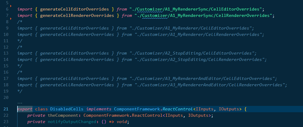
The code contains all three solutions. To switch between solutions, just pick the corresponding import in index.ts
Below is listed the structure of the repository, containing all 3 solutions. I’ve added also a “Sync” solution, in case you don’t need the async requests, which makes the code a little easier. But the “sync” solution could be applied with all 3 solutions.
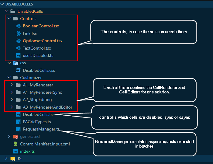
The implementation – helper constructs
DisabledCells definition
The definition of the disabled cells is made inside DisabledCells.ts. The function getCellDisabledInfo checks (based on the cell name and value) if the cell should be disabled , if it should be made async or not and returns the IDisabledCellInfo back:
exportinterfaceIDisabledCellInfo { columnName: string; value: any; isAsync : boolean; column: ColumnDefinition; rowData: any; dataType: ColumnDataType | undefined; id: string;} |
RequestManager – async simulator
If disabling is based on columns not available in the view, we need to fetch them first. In my older blog I’ve described how to make requests from inside a cell, and bundle the requests in batches, to reduce the number of request.
The requestManager I’m using for this example doesn’t make fetches; I’m using window.setTimeout to have more control over the duration of the async process. After 5sec. I’m generating some random data. The complete code for the async requests is here, but the core is a mockup generation. This is called debounced, using the debounce-promise library, in order to bundle more ids in a “request”
privateretrieveRecords = async(ids: string[]) => { const myCache = this.cache; const result = awaitnewPromise((resolve, reject)=>{ window.setTimeout(()=>{ ids.forEach((id)=>{ if(myCache[id]==null){ myCache[id] = { gendercode : Math.random()>0.5, diana_allowmail : Math.random()>0.5, .... } } }); resolve(ids.map((id) => myCache[id])); }, 5000); }); returnresult; } |
Beside the getRecords method, I’ve added also a getCached. That helps to use the standard renderer insted of my own, in case I have already the data cached. Because when my own renderer control is used, I don’t have a way to switch back to standard once the request is solved. That’s why I cannot use promises as a common base for my renderer.
My own disabled controls
For that I’ve implemented a custom hook: useIsDisabled. I can use it in all the controls, and includes also the logic of waiting for the async requests:
exportconst useIsDisabled = (requestManager: RequestManager | null, rowId: string, columnName : string) => { const initialDisabled = requestManager?.getCached(rowId)?.[columnName]; const [isDisabled, setIsDisabled] = React.useState<boolean>(initialDisabled ?? true); const mounted = React.useRef(false); React.useEffect(() => { mounted.current = true; return() => { mounted.current = false; }; }, []); React.useEffect(() => { if(!rowId){ return; } if(initialDisabled ==null){ requestManager?.getRecords(rowId) .then((c) => { if(mounted.current){ setIsDisabled(c[columnName]); } }); } },[rowId, columnName]); return[isDisabled];} |
Inside my own controls, I can use the hook. If the control doesn’t need async requests, just replace the isDisabled with true.
exportconst BooleanControl = React.memo(functionBooleanControlRaw({rowId, requestManager, onLabel, offLabel, value, onClick, name}: IBooleanDisabledControlProps){ //if you have only sync disabling, replace next line with const isDisabled= true; const [isDisabled] = useIsDisabled(requestManager,rowId, name); return(<div style={{ display: "inline-flex", alignItems: "center", width: "100%", "flexDirection": "column"}}> <Toggle disabled={isDisabled} checked={value || false} onText={onLabel} offText={offLabel} onClick={onClick}/> </div>); }); |

Here an example for the OptionsetControl
exportconst OptionSetControl = React.memo(functionOptionSetControlRaw({rowId, requestManager, value, formattedValue, onClick, dropDownOptions, name}: IOptionSetDisabledControlProps){ const [isDisabled] = useIsDisabled(requestManager,rowId, name); const option = dropDownOptions.find((option: any) => option.key == value); functionstartEditing(){ if(isDisabled==false&& onClick!=null){ onClick(); } } return(<div className={isDisabled ? "dianamics_cell_container_disabled": "dianamics_cell_container"} onClick={startEditing}> <div className="dianamics_cell"> <span className="optionset_label"style={{backgroundColor:option?.data?.color }}>{formattedValue}</span> {isDisabled && <Icon iconName="Uneditable"/>} </div> </div>); }); |
Solution A1: MyRenderer
CellRenderer
For this solution, the CellRenderer is using my own controls
const cellRendererOverrides: CellRendererOverrides = { ["Text"]: (props: CellRendererProps, rendererParams: GetRendererParams) => { returntextRenderer(props, rendererParams, requestManager); }, ["Email"]: (props: CellRendererProps, rendererParams: GetRendererParams) => { returnlinkRenderer(props, rendererParams, requestManager, `mailto:${props.value}`); }, ["Phone"]: (props: CellRendererProps, rendererParams: GetRendererParams) => { returnlinkRenderer(props, rendererParams, requestManager, `tel:${props.value}`); }, ["OptionSet"]: (props: CellRendererProps, rendererParams: GetRendererParams) => { returnoptionsetRenderer(props, rendererParams, requestManager); }, ["TwoOptions"]: (props: CellRendererProps, rendererParams: GetRendererParams) => { returnbooleanRenderer(props, rendererParams, requestManager); }, ....} |
The renderer have a pretty simple structure
functionoptionsetRenderer(props: CellRendererProps, rendererParams: GetRendererParams, requestManager: RequestManager){ const cellInfo = getCellDisabledInfo(props, rendererParams); if(cellInfo==null){ returnnull; } const disabledCache = requestManager.getCached(cellInfo.id); //if it should be disabled async, or if the data is already fetched, or is always disabled if(cellInfo.isAsync===false|| disabledCache==null|| disabledCache?.[cellInfo.columnName]===true){ return(<OptionSetControl name={cellInfo.columnName} rowId={cellInfo.id} requestManager={cellInfo.isAsync ? requestManager : null} dropDownOptions={(cellInfo.column as any).customizerParams?.dropDownOptions} value={props.value as any} formattedValue={props.formattedValue ?? ""} onClick={props.startEditing} />); } //otherwise return null, and the grid will use the standard control returnnull; } |
The other renderer are similar.
For e-mail, phone or lookup I use a link control. For phone, lookup I can specify the href. For the lookup I use the PCF context.navigation to open the form.
CellEditor
Each data type has the same structure:
const cellEditorOverrides: CellEditorOverrides = { ["Text"]: (props: CellEditorProps, rendererParams: GetEditorParams) => { handleDisableCell(props, rendererParams, requestManager); returnnull; }....} |
Where the handleCells is calling stopEditing if needed
functionhandleDisableCell(defaultProps: CellEditorProps, rendererParams: GetEditorParams, requestManager: RequestManager){ const cellInfo = getCellDisabledInfo(defaultProps, rendererParams); if(cellInfo==null){ returnnull; } const disabledCache = requestManager.getCached(cellInfo.id); if(cellInfo.isAsync===true&& disabledCache==null){ //the data was requested by the cell renderer, but the promise is not back yet //console.warn(`render for cell editor ${cellInfo.id} is async, but not resolved yet. Cell will be disabled`); rendererParams.stopEditing(true); } else{ // sync or already cached if(cellInfo.isAsync===false|| disabledCache?.[cellInfo.columnName]===true){ rendererParams.stopEditing(true); } } } |
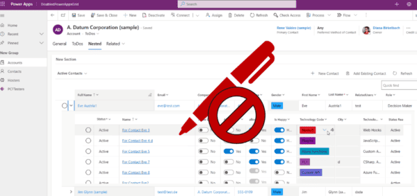
In the example below, I disabled the column “relatedusers” only for the value =”PCF”. The other ones are editable. And inside the nested grid I’ve disabled the column City for the complete column. The Technology Code and allowMail are disabled async (I decide random which of them are editable)
The result: cells are enabled after the async request is back, while the other ones are directly disabled. YouTube Link
Implementation of A1:MyRenderer Sync
The only difference here is that I don’t need to work with requestManager, and the Editor will directly stop editing
functionhandleDisableCell(defaultProps: CellEditorProps, rendererParams: GetEditorParams){ const cellInfo = getCellDisabledInfo(defaultProps, rendererParams); if(cellInfo==null){ returnnull; } rendererParams.stopEditing(true); } |
Besides that, the controls can work directly with a constant const isDisabled=true.
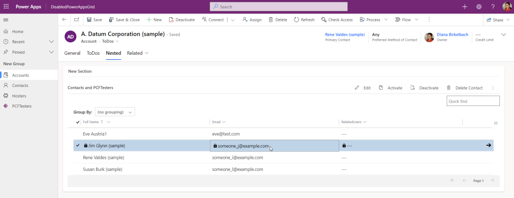
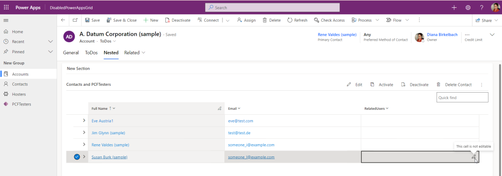
The cells are disabled. The column RelatedUsers is disabled only for some values.
YouTube link
Solution A2:StopEditing
This solution relies on CSS attached to my own attribute added to the hosting cell, and stopEditing in cellEditor.
CellRenderer
Inside CellRenderer I only need to add the attribute to the cell. In case we need async calls first, the handler will start the requests, but it attaches the attribute to the cell only after the async call is back.
const cellRendererOverrides: CellRendererOverrides = { ["Text"]: (props: CellRendererProps, rendererParams: GetRendererParams) => { handleDisabledRenderer(props, rendererParams, requestManager); returnnull; }, ...} |
functionhandleDisabledRenderer(props: CellRendererProps, rendererParams: GetRendererParams, requestManager: RequestManager): IDisabledCellInfo | null{ const cellInfo = getCellDisabledInfo(props, rendererParams); if(cellInfo==null){ returnnull; } const disabledCache = requestManager.getCached(cellInfo.id); if(cellInfo.isAsync===true&& disabledCache==null){ requestManager.getRecords(cellInfo.id).then((disabledData)=>{ if(disabledData?.[cellInfo.columnName]===true){ (props as any).cellContainerElement?.setAttribute("dianamics_uneditable", "true"); } }) } else{ if(cellInfo.isAsync===false|| disabledCache?.[cellInfo.columnName]===true){ (props as any).cellContainerElement?.setAttribute("dianamics_uneditable", "true"); } } returncellInfo; } |
Boolean is special
The TwoOptions (boolean) cells are speacial: they contains the controls also in the out-of-the-box renderer. A click on them will change the value, before they switch to the cellEditor. To solve that, I’m treating the booleans like in the solution A1_MyRendrer: I render my own toggle control (BooleanControl).
The CellEditor
Here all we have to do is to stopEditing()
exportconst generateCellEditorOverrides = (requestManager: RequestManager, navigation: ComponentFramework.Navigation)=>{ const cellEditorOverrides: CellEditorOverrides = { ["Text"]: (defaultProps: CellEditorProps, rendererParams: GetEditorParams) => { handleDisableCell(defaultProps, rendererParams, requestManager); returnnull; }, ["OptionSet"]: (defaultProps: CellEditorProps, rendererParams: GetEditorParams) => { handleDisableCell(defaultProps, rendererParams, requestManager); returnnull; }, ["TwoOptions"]: (defaultProps: CellEditorProps, rendererParams: GetEditorParams) => { //no need to stop editing here, since the user can start editing only if our own cellRenderer allows it returnnull; } } returncellEditorOverrides;} |
As a result, for the disabling the cells async, we get the visual feedback only after the promise is resolved. The gray background works well, but the “Uneditable” symbol is not really well shown if there is not enough space.
Disabling is async. The background color and the uneditable symbol is added using CSS :after selector, only after the request was made .
See on YouTube
Solution A3: MyRendererAndEditor
This solution needs the most effort: we need to implement both the CellRenderer and the CellEditor. But we can reuse the controls we had from solution A1_MyRenderer. The only difference: onClick we use stopEditing or startEditing, depending if we are in CellRenderer or CellEditor. The onClick is needed because the async process. When the promise is resolved, the editor is not changed to standard right away (if the cell should be editable). But as soon the user clicks on the cell, the renderer will be reevaluated, and if editing is allowed now, we return null and let the Power Apps Grid use it’s own controls.
CellEditor and CellRenderer
Now both the CellEditor and the CellRenderer are using the the renderer
//cellEditorconst cellEditorOverrides: CellEditorOverrides = { ["Text"]: (props: CellEditorProps, rendererParams: GetEditorParams) => { returntextRenderer(props, rendererParams, requestManager); }, ["Email"]: (props: CellEditorProps, rendererParams: GetEditorParams) => { returnlinkRenderer(props, rendererParams, requestManager, `mailto:${props.value}`); }...}//cellRenderer const cellRendererOverrides: CellRendererOverrides = { ["Text"]: (props: CellRendererProps, rendererParams: GetRendererParams) => { returntextRenderer(props, rendererParams, requestManager); }, ["Email"]: (props: CellRendererProps, rendererParams: GetRendererParams) => { returnlinkRenderer(props, rendererParams, requestManager, `mailto:${props.value}`); }...} |
And example for renderer (textRenderer), used both with CellRendere props and with the CellEditor props:
exportfunctiontextRenderer( props: CellRendererProps | CellEditorProps, rendererParams: GetRendererParams| GetEditorParams, requestManager: RequestManager){ const cellInfo = getCellDisabledInfo(props, rendererParams); if(cellInfo==null){ returnnull; } //because the formattedValue works for editor different than for the renderer const formattedValue = (props as any).formattedValue ?? (cellInfo.column as any).getFormattedValue(cellInfo.rowData?.[RECID]) ?? (cellInfo.rowData as any)[cellInfo.columnName] ?? " "; const disabledCache = requestManager.getCached(cellInfo.id); if(cellInfo.isAsync===false|| disabledCache==null|| disabledCache?.[cellInfo.columnName]===true){ return(<TextControl name={cellInfo.columnName} rowId={cellInfo.id} requestManager={cellInfo.isAsync ? requestManager : null} value={props.value as string} formattedValue={formattedValue} onClick={(props as any).startEditing ?? (props as any).stopEditing} //startEditing or stopEditing />); } returnnull; } |
This approach feels the best: a little better than previous solutions because there is no flickering when the standard editor sometimes kicks in.
Best experience. See on YouTube
Conclusion
We saw 3 ways to implement the disabled column.
In A2_stopEditing we have almost no code, but the visual feedback it’s a little unsupported. Also we had to implement the code for the boolean control.
The A1_MyRenderer is implementing the controls for renderer, and is using the stopEditing method instead of implementing the edit controls.
A3_MyRendereAndEditor is implementing the controls for both the renderer and the editor. The bigger effort for the best user experience.
Right now it’s a little hard to make this control generic. The hard part: I don’t have the information about the table where the customizer control is registered on; so I don’t know how to implement the navigation for the primary column. I saw there are some navigation functions, but they are not documented and didn’t work in my test. So maybe in the future we’ll get a way for a complete generic implementation.
Speaking of sdk possibilities: this implementation is pretty complex; making the fields disabled should be pretty basic. The best would be if we can forget this blog, and be able to use the sdk just to set the cells on disabled (also on the edge cases where I had issues with form scripting).
Links
Here is a list of links used in this blog:
- My GitHub Repository: https://github.com/brasov2de/GridCustomizerControl/tree/main/DisabledCells
- docs about PAG customizer control: https://learn.microsoft.com/en-us/power-apps/developer/component-framework/customize-editable-grid-control?WT.mc_id=BA-MVP-5004107
- Grid and subgrid api for JavaScript WebResources: https://learn.microsoft.com/en-us/power-apps/developer/model-driven-apps/clientapi/reference/grids?WT.mc_id=BA-MVP-5004107
- Benedikt’s blog about disabling cell in EditableGrid nested grids: https://benediktbergmann.eu/2023/02/22/read-only-nested-editable-grid/
- All my blogs about Power Apps Grid customizer control: https://dianabirkelbach.wordpress.com/category/power-apps-grid-control/
ABOUT THE AUTHOR
Hi! My name is Diana Birkelbach and I’m a developer, working at ORBIS SE . Together with the team we develop generic components and accelerators for Dynamics 365 and Power Platform.
One of the biggest accomplishments are the Microsoft Most Valuable Professional Award (MVP) in Business Applications for 2021.
REFERENCES
Birkelback, D., (2023), ‘Disable Cells Using Power Apps Grid Customizer Control‘, available at: https://dianabirkelbach.wordpress.com/2023/07/15/disable-cells-using-power-apps-grid-customizer-control/, [accessed 28th March 2024].


