A Step-by-Step Guide for Great UX in Canvas Apps
User Experience (UX) is very important not only in Power Apps but in daily life. Afterall, what would life be with poor UX? One thing for sure is, we would all be very frustrated! Lennert and Kristof believe that UX is very important whenever they are building Canvas Apps. This is why they created a step-by-step guide for you to achieve a wonderful UX.
Lennert Verwimp and Kristof Leyssens join us in this webinar recording from Power Platform week where they talk about all things UX in Canvas Apps. Watch this full webinar recording and learn how to create a wonderful UX in Power Apps.
More About the Session ‘A Step-by-Step Guide for Great UX in Canvas Apps’
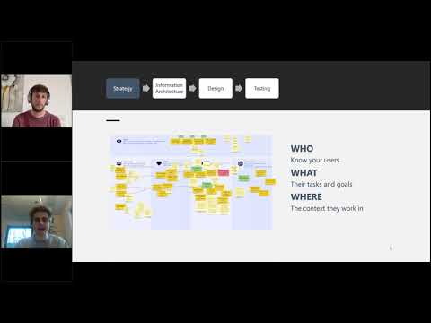
Lennert and Kristof take us through a step-by-step tutorial for creating a great User Experience in Canvas Apps. But what does this entail? In this session, you will learn what UX is. Kristof talks about the difference between UX and UI, and when to consider UX in Power Apps. He also takes us through 4 steps to success when developing important apps for your organisation or department. These 4 steps include developing a good strategy, defining an information architecture, designing the app, and finally, testing the app.
Step 1 – Strategy Development for Great UX in Canvas Apps
When discussing the first step, strategy, Kristof talks about the importance of mapping out a good strategy before getting into the practicalities of app building. He explains the main principle in strategy development which is that you need to see things from the user’s point of view. Who are your users? what are their tasks and goals? and where do they work/the context they work in.
Step 2 – Information Architecture
The next step for a successful UX that Kristof discusses is information architecture. He explains the importance of mapping out the different functionalities of the different streams within the app. He also discusses two models which he believes to be very important in mapping out the information architecture of a canvas app. The first model, The Happy Flow model, is the most optimal process to a desired goal. The second model, The Mental Model, is the most logical way to get something done.
Step 3 – Design
Next, Lennert takes you through a demo on some tips and tricks on how to make a questionnaire app as nice as you can for a user. Lennert also discusses the best practices for styling within Power Apps. The best practices document Lennert talks about is available here.
Then Lennert takes you through another demo on a use case where he built an application with a lot of colour. He does this to show that Power Apps does not have to look like the Power Apps that you are used to. You have a lot of flexibility but you have to be creative!
Step 4 – Testing
Lastly, Kristof runs through what to test once you have developed your prototype application. He also explains the different ways you can test your application. He talks about why and when you might use manual testing versus automated testing.
Q&A
1. Possibility to create templates:
I think this would be possible when working with variables like I showed in the demo. So you create a variable that contains values for all colors, fonts and margins. Then you should reference these when styling your application. If you want to change the style, you should change the content of this variable. You could work with conditions here.
2. What if you want to make an app responsive for phone or tablet:
You should first think about what form factors you want your app to support and how it should look for each form factor. When do you want certain items to be next to or below each other, and how wide should they be? If you want to create a fully customized app, you should create your own nested containers (there are some great videos online on how this all works). But if you want to start smaller, you can use the default responsive screens you get when you add a new screen to your app.
3. Fluent controls announcement:
I like them. They make it easier to create good-looking apps quickly. However, they give a little less flexibility when it comes to styling. In terms of UX, the date picker is a big improvement as it is better looking and allows the user to select their desired date much faster.
Stay up to Date
Register for upcoming webinars here.
Catch up on the latest blogs, eBooks, webinars, and how-to videos.
Not a member? Sign up today to unlock all content.
Subscribe to our YouTube channel.
Find us on Twitter, Instagram, LinkedIn, Facebook.
Log In