By detecting the theme parameter that Teams passes to Power Apps canvas apps when added as Tabs or Personal apps, we are able to make them Teams theme aware, but the same does not happen when we add a Canvas app to SharePoint using the standard Power Apps WebPart.
However, there is a free open-source sample in the Microsoft 365 PnP sp-dev-fx-webparts Repository (Enhanced Power Apps WebPart) that we can use to help achieving that. This WebPart adds extra features, such as dynamic resizing, theme awareness, and dynamic data detection.
Configuring theme variables in the Canvas App / Preparing it to be theme aware
If you have the App.OnStart function enabled in your app, use the following code on it, otherwise use it in the Screen.OnVisible event of the screen of your Start screen:
With(
    {tmpTheme: Param("theme")},
    If(
        !IsBlank(tmpTheme),//If this parameter is not blank, App is running on Teams
        Set(
            appTheme,
            {
                bodyBackground: If(
                    tmpTheme = "dark",
                    RGBA(31,31,31,1),
                    tmpTheme = "contrast",
                    Black,
                    RGBA(245,245,245,1)
                ),
                bodyText: If(
                    tmpTheme = "dark",
                    White,
                    tmpTheme = "contrast",
                    Yellow,
                    Black
                ),
                buttonBackground: If(
                    tmpTheme = "dark",
                    RGBA(98,100,167,0.2),
                    RGBA(98,100,167,1)
                ),
                buttonText: If(
                    tmpTheme = "dark",
                    White,
                    tmpTheme = "contrast",
                    Yellow,
                    White
                )
            }
        ),
        //Otherwise it is in SharePoint, or Standalone.
        //Check values passed by the WebPart, otherwise uses a default one
        Set(
            appTheme,
            {
                bodyBackground: ColorValue(
                    Coalesce(
                        Param("bodyBackground"),
                        "white"
                    )
                ),
                bodyText: ColorValue(
                    Coalesce(
                        Param("bodyText"),
                        "black"
                    )
                ),
                buttonBackground: ColorValue(
                    Coalesce(
                        Param("primaryButtonBackground"),
                        "gray"
                    )
                ),
                buttonText: ColorValue(
                    Coalesce(
                        Param("primaryButtonText"),
                        "white"
                    )
                )
            }
        );
    )
);
The above code checks for the Teams theme parameter presence, and if it’s present it sets the colours according to Teams standards. The colours are not sent by Teams to the app, but by detecting the theme name we can manually set the variable value to the same colour schema.
If the Teams theme is not present, it means the app is running either as standalone, or as part of a page with the Enhanced Power Apps WebPart added. Then in this piece, the values configured earlier are checked, in case they are blank, default values are used by using the coalesce function.
Using the theme to make the app colours become dynamic
In this post’s sample app, the theme variable colours will have the following usage:
bodyBackground: colour for app body background, galleries background
bodyText: colour for common text in the app/galleries
buttonText: to be used in button text font colour
buttonBackground: to be used in buttons background, header background, icon colours. The same colour can be used in PressedFill / HoverFill with the help of the ColorFade function to give us the hover/click feel.
Sample properties for a button:
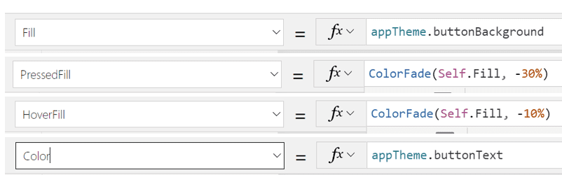
To make dynamic colours as in the session level field we use in the app’s galleries (button in view mode instead of a standard label in order to be able to use border radius):
We can use the colorfade function based on the session level value (choice) as below:
ColorFade(appTheme.buttonBackground,-1 * (Value(Coalesce(ThisItem.'Session Level'.Value,"0"))/1000))
This will make the buttons look darker as the session level field value increases.
Download the WebPart / Install it
The next step is to install the open-source PnP Enhanced Power Apps Webpart.
You can download the full source code and compile it:
https://github.com/pnp/sp-dev-fx-webparts/tree/main/samples/react-enhanced-powerapps
Or download the sppkg file directly to install from the direct link:
You will need to upload the WebPart either to the global app catalog, or to a site collection app catalog, in case you want to restrict it to a single SharePoint site collection. After uploading the WebPart and installing it to the site you want, now you need to add the WebPart to a SharePoint page.

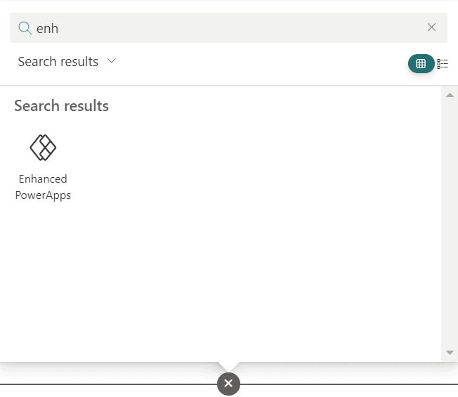
After the WebPart is deployed & installed to the site, create a page and find the WebPart to add it from the gallery (preferrably to a one-column section):
Add the WebPart link, and select the settings you wish for layout. My preference is to keep it without borders and set fixed height (responsiveness works better this way):
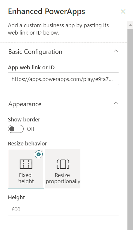
Select also the theme properties to send as parameter:
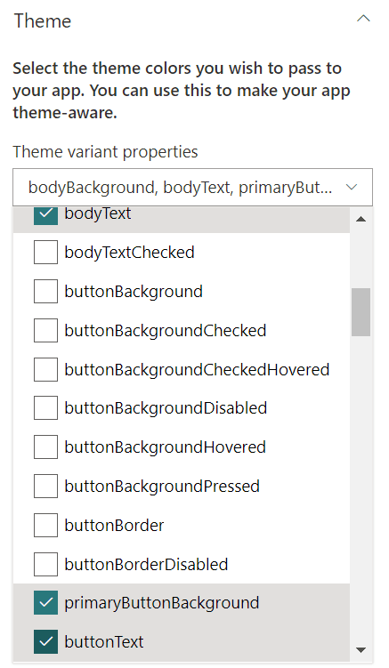
In this example we will need the following properties:
- bodyBackground
- bodyText
- primaryButtonBackground
- buttonText
There are more useful properties, but as in the Canvas App we are using colour fading options, in this case those 4 are enough to illustrate the idea. Save the page and you are now good to go.
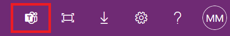
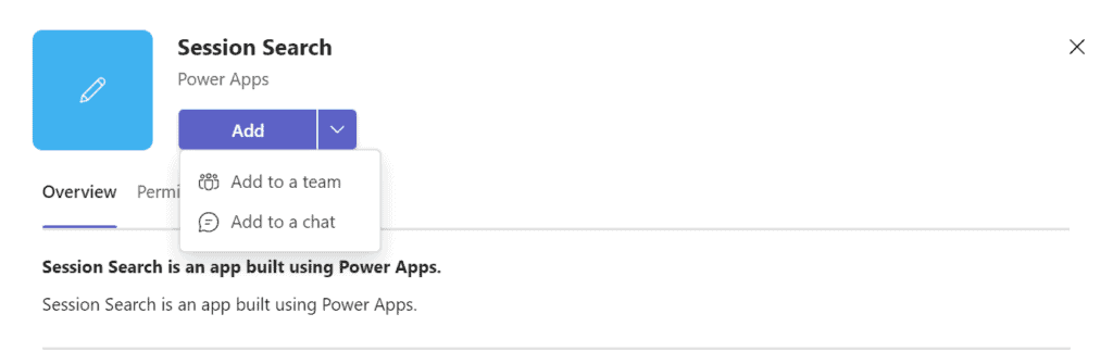
If you want to add the Canvas App to teams as a Teams app, you can easily do that from the Canvas App web player, from the top right side menu:
Then select where to add it in Teams:
Or alternatively, export a deployment package from the maker portal and deploy it globally from the Teams Admin center.
Results
Now, according to where you use the Canvas app, the theme will be dynamically detected and it will adjust itself as below.
Standalone Canvas App outside of SharePoint:
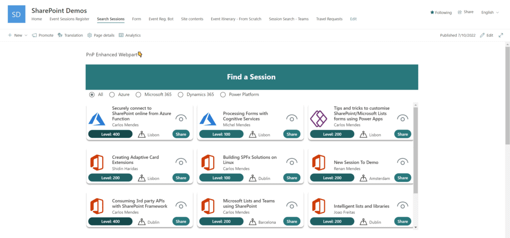
Canvas App added to a SharePoint page in a Site with bright themes:
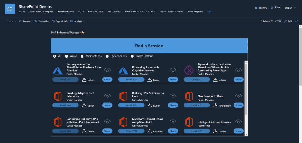
Canvas App added to a SharePoint page in a Site with a dark theme:
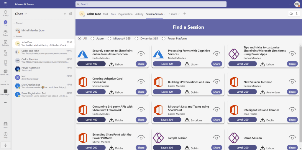
App installed in Teams running Default theme:
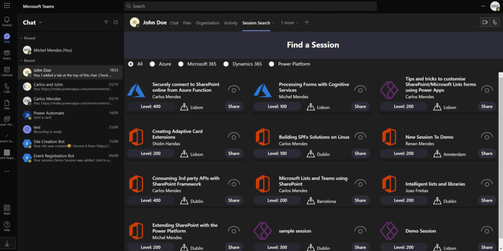
App installed in Teams running Dark theme:
Conclusion
By detecting querystring parameters sent to a Canvas App and with the help of the PnP Enhanced Power Apps WebPart, we are able to make the same Canvas app be aware of the themes of SharePoint and Teams.
About the Author
Microsoft 365 & Power Platform Consultant/Developer
Reference
Mendes, M., 2022, Making a Canvas app become Teams & SharePoint theme aware (with the help of the PnP Enhanced Power Apps WebPart), Available at: Making a Canvas app become Teams & SharePoint theme aware (with the help of the PnP Enhanced Power Apps WebPart) – michelcarlo [Accessed on 11 January 2023]


